-
CSS 教程
- CSS 主页
- CSS 简介
- CSS 语法
- CSS 选择器
- CSS 如何使用
- CSS 注释
- CSS 颜色
- CSS 背景
- CSS 边框
- CSS 外边距
- CSS 内边距
- CSS 高度/宽度
- CSS 盒子模型
- CSS 外轮廓
- CSS 文本
- CSS 字体
- CSS 图标
- CSS 链接
- CSS 列表
- CSS 表格
- CSS 显示
- CSS 最大宽度
- CSS 位置
- CSS Z-index
- CSS 溢出
- CSS 浮动
- CSS 行内块
- CSS 对齐
- CSS 组合器
- CSS 伪类
- CSS 伪元素
- CSS 不透明度
- CSS 导航栏
- CSS 下拉菜单
- CSS 图片画廊
- CSS 图片精灵
- CSS 属性选择器
- CSS 表单
- CSS 计数器
- CSS 网站布局
- CSS 单位
- CSS 特异性
- CSS !important
- CSS 数学函数
- CSS 高级
- CSS 响应式
- CSS 网格
- CSS SASS
- CSS 示例
- CSS 参考
响应式网页设计 - 媒体查询
什么是媒体查询?
媒体查询是 CSS3 中引入的 CSS 技术。
它使用@media仅当特定条件为真时才包含 CSS 属性块的规则。
示例
如果浏览器窗口为 600px 或更小,则背景颜色将为浅蓝色:
@media only screen and (max-width: 600px) {
body {
background-color: lightblue;
}
}
亲自试一试 »
添加断点
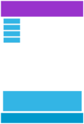
在本教程的前面部分,我们制作了一个包含行和列的网页,它具有响应性,但在小屏幕上看起来不太好。
媒体查询可以帮助解决这个问题。我们可以添加一个断点,其中设计的某些部分在断点两侧的行为会有所不同。

桌面

电话
使用媒体查询在 768px 处添加断点:
示例
当屏幕(浏览器窗口)小于 768px 时,每列的宽度应为 100%:
/* For desktop: */
.col-1 {width: 8.33%;}
.col-2 {width: 16.66%;}
.col-3 {width: 25%;}
.col-4 {width: 33.33%;}
.col-5 {width: 41.66%;}
.col-6 {width: 50%;}
.col-7 {width: 58.33%;}
.col-8 {width: 66.66%;}
.col-9 {width: 75%;}
.col-10 {width: 83.33%;}
.col-11 {width: 91.66%;}
.col-12 {width: 100%;}
@media only screen and (max-width: 768px) {
/* For mobile phones: */
[class*="col-"] {
width: 100%;
}
}
亲自试一试 »
始终以移动设备为先进行设计
移动优先意味着在为桌面或任何其他设备设计之前为移动设备进行设计(这将使页面在较小的设备上显示得更快)。
这意味着我们必须对 CSS 进行一些更改。
而不是当宽度变大时改变样式较小大于768px,当宽度达到时我们应该改变设计更大超过 768 像素。这将使我们的设计移动优先:
示例
/* For mobile phones: */
[class*="col-"] {
width: 100%;
}
@media only screen and (min-width: 768px) {
/* For desktop: */
.col-1 {width: 8.33%;}
.col-2 {width: 16.66%;}
.col-3 {width: 25%;}
.col-4 {width: 33.33%;}
.col-5 {width: 41.66%;}
.col-6 {width: 50%;}
.col-7 {width: 58.33%;}
.col-8 {width: 66.66%;}
.col-9 {width: 75%;}
.col-10 {width: 83.33%;}
.col-11 {width: 91.66%;}
.col-12 {width: 100%;}
}
亲自试一试 »
另一个断点
您可以添加任意数量的断点。
我们还将在平板电脑和手机之间插入断点。
桌面
药片
电话
为此,我们添加了一个媒体查询(600 像素),以及一组针对大于 600 像素(但小于 768 像素)的设备的新类:
示例
请注意,两组类几乎相同,唯一的区别是名称(col-和col-s-):
/* For mobile phones: */
[class*="col-"] {
width: 100%;
}
@media only screen and (min-width: 600px) {
/* For tablets: */
.col-s-1 {width: 8.33%;}
.col-s-2 {width: 16.66%;}
.col-s-3 {width: 25%;}
.col-s-4 {width: 33.33%;}
.col-s-5 {width: 41.66%;}
.col-s-6 {width: 50%;}
.col-s-7 {width: 58.33%;}
.col-s-8 {width: 66.66%;}
.col-s-9 {width: 75%;}
.col-s-10 {width: 83.33%;}
.col-s-11 {width: 91.66%;}
.col-s-12 {width: 100%;}
}
@media only screen and (min-width: 768px) {
/* For desktop: */
.col-1 {width: 8.33%;}
.col-2 {width: 16.66%;}
.col-3 {width: 25%;}
.col-4 {width: 33.33%;}
.col-5 {width: 41.66%;}
.col-6 {width: 50%;}
.col-7 {width: 58.33%;}
.col-8 {width: 66.66%;}
.col-9 {width: 75%;}
.col-10 {width: 83.33%;}
.col-11 {width: 91.66%;}
.col-12 {width: 100%;}
}
我们有两组相同的类可能看起来很奇怪,但它给了我们机会在 HTML 中,决定每个断点处的列会发生什么:
HTML 示例
对于桌面:
第一部分和第三部分各跨 3 列。中间部分将跨越 6 列。
对于平板电脑:
第一部分将跨越 3 列,第二部分将跨越 9 列,第三部分将显示在前两部分下方,它将跨越 12 列:
<div class="row">
<div class="col-3 col-s-3">...</div>
<div class="col-6 col-s-9">...</div>
<div class="col-3 col-s-12">...</div>
</div>
亲自试一试 »
典型设备断点
有大量具有不同高度和宽度的屏幕和设备,因此很难为每个设备创建精确的断点。为了简单起见,您可以针对五个群体:
示例
/* Extra small devices (phones, 600px and down) */
@media only screen and (max-width: 600px) {...}
/* Small devices (portrait tablets and large phones, 600px and up) */
@media only screen and (min-width: 600px) {...}
/* Medium devices (landscape tablets, 768px and up) */
@media only screen and (min-width: 768px) {...}
/* Large devices (laptops/desktops, 992px and up) */
@media only screen and (min-width: 992px) {...}
/* Extra large devices (large laptops and desktops, 1200px and up) */
@media only screen and (min-width: 1200px) {...}
亲自试一试 »
方向:纵向/横向
媒体查询还可用于根据浏览器的方向更改页面布局。
您可以拥有一组 CSS 属性,这些属性仅在浏览器窗口宽于其高度时应用,即所谓的 "Landscape" 方向:
示例
如果方向为横向模式,网页将具有浅蓝色背景:
@media only screen and (orientation: landscape) {
body {
background-color: lightblue;
}
}
亲自试一试 »
使用媒体查询隐藏元素
媒体查询的另一个常见用途是隐藏不同屏幕尺寸上的元素:
示例
/* If the screen size is 600px wide or less, hide the element */
@media only screen and (max-width: 600px) {
div.example {
display: none;
}
}
亲自试一试 »
使用媒体查询更改字体大小
您还可以使用媒体查询来更改不同屏幕尺寸上元素的字体大小:
可变字体大小。
示例
/* If the screen size is 601px or more, set the font-size of <div> to 80px */
@media only screen and (min-width: 601px) {
div.example {
font-size: 80px;
}
}
/* If the screen size is 600px or less, set the font-size of <div> to 30px */
@media only screen and (max-width: 600px) {
div.example {
font-size: 30px;
}
}
亲自试一试 »
CSS @media 参考
有关所有媒体类型和功能/表达的完整概述,请查看CSS 参考中的 @media 规则。
截取页面反馈部分,让我们更快修复内容!也可以直接跳过填写反馈内容!