目录
-
CSS 教程
- CSS 主页
- CSS 简介
- CSS 语法
- CSS 选择器
- CSS 如何使用
- CSS 注释
- CSS 颜色
- CSS 背景
- CSS 边框
- CSS 外边距
- CSS 内边距
- CSS 高度/宽度
- CSS 盒子模型
- CSS 外轮廓
- CSS 文本
- CSS 字体
- CSS 图标
- CSS 链接
- CSS 列表
- CSS 表格
- CSS 显示
- CSS 最大宽度
- CSS 位置
- CSS Z-index
- CSS 溢出
- CSS 浮动
- CSS 行内块
- CSS 对齐
- CSS 组合器
- CSS 伪类
- CSS 伪元素
- CSS 不透明度
- CSS 导航栏
- CSS 下拉菜单
- CSS 图片画廊
- CSS 图片精灵
- CSS 属性选择器
- CSS 表单
- CSS 计数器
- CSS 网站布局
- CSS 单位
- CSS 特异性
- CSS !important
- CSS 数学函数
- CSS 高级
- CSS 响应式
- CSS 网格
- CSS SASS
- CSS 示例
- CSS 参考
CSS 网格简介
标头
菜单
主要的
正确的
页脚
网格布局
CSS 网格布局模块提供基于网格的布局系统,具有行和列,使设计网页变得更容易,而无需使用浮动和定位。
浏览器支持
所有现代浏览器都支持网格属性。
| 57.0 | 16.0 | 52.0 | 10 | 44 |
网格元素
网格布局由一个父元素和一个或多个子元素组成。
示例
<div class="grid-container">
<div class="grid-item">1</div>
<div class="grid-item">2</div>
<div class="grid-item">3</div>
<div class="grid-item">4</div>
<div class="grid-item">5</div>
<div class="grid-item">6</div>
<div class="grid-item">7</div>
<div class="grid-item">8</div>
<div class="grid-item">9</div>
</div>
1
2
3
4
5
6
7
8
9
显示属性
当 HTML 元素成为网格容器时display属性设置为grid或者inline-grid。
网格容器的所有直接子级都会自动成为网格项目。
网格列
网格项的垂直线称为列。

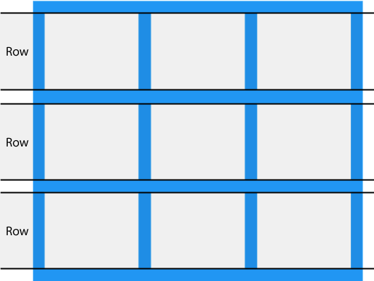
网格行
网格项的水平线称为行。
网格间隙
每列/行之间的空间称为差距。

您可以使用以下属性之一调整间隙大小:
column-gaprow-gapgap
示例
这个gapproperty 是属性的简写row-gap和column-gap特性:
.grid-container {
display: grid;
gap: 50px 100px;
}
网格线
列之间的线称为柱线。
行之间的线称为行线。

将网格项放入网格容器时请参考行号:
所有 CSS 网格属性
| Property | Description |
|---|---|
| column-gap | Specifies the gap between the columns |
| gap | A shorthand property for the row-gap and the column-gap properties |
| grid | A shorthand property for the grid-template-rows, grid-template-columns, grid-template-areas, grid-auto-rows, grid-auto-columns, and the grid-auto-flow properties |
| grid-area | Either specifies a name for the grid item, or this property is a shorthand property for the grid-row-start, grid-column-start, grid-row-end, and grid-column-end properties |
| grid-auto-columns | Specifies a default column size |
| grid-auto-flow | Specifies how auto-placed items are inserted in the grid |
| grid-auto-rows | Specifies a default row size |
| grid-column | A shorthand property for the grid-column-start and the grid-column-end properties |
| grid-column-end | Specifies where to end the grid item |
| grid-column-gap | Specifies the size of the gap between columns |
| grid-column-start | Specifies where to start the grid item |
| grid-gap | A shorthand property for the grid-row-gap and grid-column-gap properties |
| grid-row | A shorthand property for the grid-row-start and the grid-row-end properties |
| grid-row-end | Specifies where to end the grid item |
| grid-row-gap | Specifies the size of the gap between rows |
| grid-row-start | Specifies where to start the grid item |
| grid-template | A shorthand property for the grid-template-rows, grid-template-columns and grid-areas properties |
| grid-template-areas | Specifies how to display columns and rows, using named grid items |
| grid-template-columns | Specifies the size of the columns, and how many columns in a grid layout |
| grid-template-rows | Specifies the size of the rows in a grid layout |
| row-gap | Specifies the gap between the grid rows |
截取页面反馈部分,让我们更快修复内容!也可以直接跳过填写反馈内容!