-
CSS 教程
- CSS 主页
- CSS 简介
- CSS 语法
- CSS 选择器
- CSS 如何使用
- CSS 注释
- CSS 颜色
- CSS 背景
- CSS 边框
- CSS 外边距
- CSS 内边距
- CSS 高度/宽度
- CSS 盒子模型
- CSS 外轮廓
- CSS 文本
- CSS 字体
- CSS 图标
- CSS 链接
- CSS 列表
- CSS 表格
- CSS 显示
- CSS 最大宽度
- CSS 位置
- CSS Z-index
- CSS 溢出
- CSS 浮动
- CSS 行内块
- CSS 对齐
- CSS 组合器
- CSS 伪类
- CSS 伪元素
- CSS 不透明度
- CSS 导航栏
- CSS 下拉菜单
- CSS 图片画廊
- CSS 图片精灵
- CSS 属性选择器
- CSS 表单
- CSS 计数器
- CSS 网站布局
- CSS 单位
- CSS 特异性
- CSS !important
- CSS 数学函数
- CSS 高级
- CSS 响应式
- CSS 网格
- CSS SASS
- CSS 示例
- CSS 参考
CSS 2D 变换
CSS 2D 变换
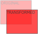
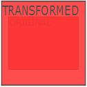
CSS 变换允许您移动、旋转、缩放和倾斜元素。
将鼠标悬停在下面的元素上可查看 2D 变换:
在本章中,您将了解以下 CSS 属性:
transform
浏览器支持
表中的数字指定完全支持该属性的第一个浏览器版本。
| Property | |||||
|---|---|---|---|---|---|
| transform | 36.0 |
10.0 |
16.0 |
9.0 |
23.0 |
CSS 2D 转换方法
通过CSStransform属性,您可以使用以下 2D 变换方法:
translate()rotate()scaleX()scaleY()scale()skewX()skewY()skew()matrix()
提示:您将在下一章中了解 3D 变换。
翻译()方法
这个translate()方法将元素从当前位置移动(根据为 X 轴和 Y 轴给出的参数)。
以下示例将 <div> 元素从当前位置向右移动 50 像素,向下移动 100 像素:
旋转()方法
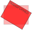
这个rotate()方法根据给定的角度顺时针或逆时针旋转元素。
以下示例将 <div> 元素顺时针旋转 20 度:
使用负值将使元素逆时针旋转。
以下示例将 <div> 元素逆时针旋转 20 度:
scale() 方法
这个scale()方法增加或减少元素的大小(根据给定的宽度和高度参数)。
以下示例将 <div> 元素增加为其原始宽度的两倍和原始高度的三倍:
以下示例将 <div> 元素减小为其原始宽度和高度的一半:
scaleX() 方法
这个scaleX()方法增加或减少元素的宽度。
以下示例将 <div> 元素增加为其原始宽度的两倍:
以下示例将 <div> 元素减小为其原始宽度的一半:
scaleY() 方法
这个scaleY()方法增加或减少元素的高度。
以下示例将 <div> 元素增加到其原始高度的三倍:
以下示例将 <div> 元素减小到其原始高度的一半:
skewX() 方法
这个skewX()方法将元素沿 X 轴倾斜给定角度。
以下示例将 <div> 元素沿 X 轴倾斜 20 度:
skewY() 方法
这个skewY()方法将元素沿 Y 轴倾斜给定角度。
以下示例将 <div> 元素沿 Y 轴倾斜 20 度:
skew() 方法
这个skew()方法将元素沿 X 轴和 Y 轴倾斜给定的角度。
以下示例将 <div> 元素沿 X 轴倾斜 20 度,沿 Y 轴倾斜 10 度:
如果未指定第二个参数,则其值为零。因此,以下示例将 <div> 元素沿 X 轴倾斜 20 度:
矩阵()方法
这个matrix()方法将所有 2D 变换方法合二为一。
Matrix() 方法采用六个参数,其中包含数学函数,允许您旋转、缩放、移动(平移)和倾斜元素。
参数如下:matrix(scaleX()、skewY()、skewX()、scaleY()、translateX()、translateY())
CSS 变换属性
下表列出了所有 2D 变换属性:
| Property | Description |
|---|---|
| transform | Applies a 2D or 3D transformation to an element |
| transform-origin | Allows you to change the position on transformed elements |
CSS 2D 变换方法
| Function | Description |
|---|---|
| matrix(n,n,n,n,n,n) | Defines a 2D transformation, using a matrix of six values |
| translate(x,y) | Defines a 2D translation, moving the element along the X- and the Y-axis |
| translateX(n) | Defines a 2D translation, moving the element along the X-axis |
| translateY(n) | Defines a 2D translation, moving the element along the Y-axis |
| scale(x,y) | Defines a 2D scale transformation, changing the elements width and height |
| scaleX(n) | Defines a 2D scale transformation, changing the element's width |
| scaleY(n) | Defines a 2D scale transformation, changing the element's height |
| rotate(angle) | Defines a 2D rotation, the angle is specified in the parameter |
| skew(x-angle,y-angle) | Defines a 2D skew transformation along the X- and the Y-axis |
| skewX(angle) | Defines a 2D skew transformation along the X-axis |
| skewY(angle) | Defines a 2D skew transformation along the Y-axis |
截取页面反馈部分,让我们更快修复内容!也可以直接跳过填写反馈内容!