-
CSS 教程
- CSS 主页
- CSS 简介
- CSS 语法
- CSS 选择器
- CSS 如何使用
- CSS 注释
- CSS 颜色
- CSS 背景
- CSS 边框
- CSS 外边距
- CSS 内边距
- CSS 高度/宽度
- CSS 盒子模型
- CSS 外轮廓
- CSS 文本
- CSS 字体
- CSS 图标
- CSS 链接
- CSS 列表
- CSS 表格
- CSS 显示
- CSS 最大宽度
- CSS 位置
- CSS Z-index
- CSS 溢出
- CSS 浮动
- CSS 行内块
- CSS 对齐
- CSS 组合器
- CSS 伪类
- CSS 伪元素
- CSS 不透明度
- CSS 导航栏
- CSS 下拉菜单
- CSS 图片画廊
- CSS 图片精灵
- CSS 属性选择器
- CSS 表单
- CSS 计数器
- CSS 网站布局
- CSS 单位
- CSS 特异性
- CSS !important
- CSS 数学函数
- CSS 高级
- CSS 响应式
- CSS 网格
- CSS SASS
- CSS 示例
- CSS 参考
CSS 媒体查询示例
CSS 媒体查询 - 更多示例
让我们看一些使用媒体查询的更多示例。
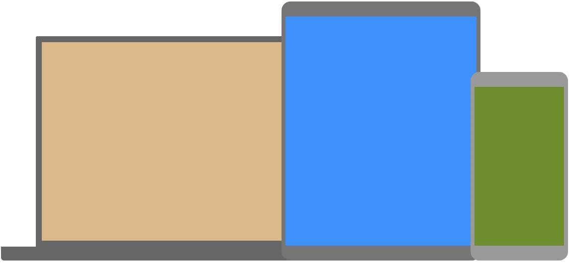
媒体查询是一种流行的技术,用于向不同设备提供定制的样式表。为了演示一个简单的例子,我们可以更改不同设备的背景颜色:
示例
/* Set the background color of body to tan */
body {
background-color: tan;
}
/* On screens that are 992px or less, set the background color to blue */
@media screen and (max-width: 992px) {
body {
background-color: blue;
}
}
/* On screens that are 600px or less, set the background color to olive */
@media screen and (max-width: 600px) {
body {
background-color: olive;
}
}
亲自试一试 »
您是否想知道为什么我们使用 992px 和 600px?它们就是我们所说的设备"typical breakpoints"。您可以在我们的文章中阅读有关典型断点的更多信息响应式网页设计教程。
菜单的媒体查询
在此示例中,我们使用媒体查询创建响应式导航菜单,其设计在不同的屏幕尺寸上有所不同。
示例
/* The navbar container */
.topnav {
overflow: hidden;
background-color: #333;
}
/* Navbar links */
.topnav a {
float: left;
display: block;
color: white;
text-align: center;
padding: 14px 16px;
text-decoration: none;
}
/* On screens that are 600px wide or less, make the menu links stack on top of each other instead of next to each other */
@media screen and (max-width: 600px) {
.topnav a {
float: none;
width: 100%;
}
}
亲自试一试 »
列的媒体查询
媒体查询的一个常见用途是创建灵活的布局。在此示例中,我们创建一个布局,根据不同的屏幕尺寸,在四列、两列和全宽列之间变化:
大屏幕:
中型屏幕:
小屏幕:
示例
/* Create four equal columns that floats next to each other */
.column {
float: left;
width: 25%;
}
/* On screens that are 992px wide or less, go from four columns to two columns */
@media screen and (max-width: 992px) {
.column {
width: 50%;
}
}
/* On screens that are 600px wide or less, make the columns stack on top of each other instead of next to each other */
@media screen and (max-width: 600px) {
.column {
width: 100%;
}
}
亲自试一试 »
提示:创建列布局的一种更现代的方法是使用 CSS Flexbox(请参见下面的示例)。但是,Internet Explorer 10 及更早版本不支持它。如果需要 IE6-10 支持,请使用浮动(如上所示)。
要了解有关灵活框布局模块的更多信息,阅读我们的 CSS Flexbox 章节。
要了解有关响应式网页设计的更多信息,阅读我们的响应式网页设计教程。
示例
/* Container for flexboxes */
.row {
display: flex;
flex-wrap: wrap;
}
/* Create four equal columns */
.column {
flex: 25%;
padding: 20px;
}
/* On screens that are 992px wide or less, go from four columns to two columns */
@media screen and (max-width: 992px) {
.column {
flex: 50%;
}
}
/* On screens that are 600px wide or less, make the columns stack on top of each other instead of next to each other */
@media screen and (max-width: 600px) {
.row {
flex-direction: column;
}
}
亲自试一试 »
使用媒体查询隐藏元素
媒体查询的另一个常见用途是隐藏不同屏幕尺寸上的元素:
示例
/* If the screen size is 600px wide or less, hide the element */
@media screen and (max-width: 600px) {
div.example {
display: none;
}
}
亲自试一试 »
使用媒体查询更改字体大小
您还可以使用媒体查询来更改不同屏幕尺寸上元素的字体大小:
可变字体大小。
示例
/* If screen size is more than 600px wide, set the font-size of <div> to 80px */
@media screen and (min-width: 600px) {
div.example {
font-size: 80px;
}
}
/* If screen size is 600px wide, or less, set the font-size of <div> to 30px */
@media screen and (max-width: 600px) {
div.example {
font-size: 30px;
}
}
亲自试一试 »
灵活的图片库
在此示例中,我们使用媒体查询和 Flexbox 来创建响应式图片库:
灵活的网站
在此示例中,我们使用媒体查询和 Flexbox 来创建响应式网站,其中包含灵活的导航栏和灵活的内容。
方向:纵向/横向
媒体查询还可用于根据浏览器的方向更改页面布局。
您可以拥有一组 CSS 属性,这些属性仅在浏览器窗口宽于其高度时应用,即所谓的 "Landscape" 方向:
示例
如果方向处于横向模式,则使用浅蓝色背景颜色:
@media only screen and (orientation: landscape) {
body {
background-color: lightblue;
}
}
亲自试一试 »
最小宽度到最大宽度
您还可以使用(max-width: ..) and (min-width: ..)设置最小宽度和最大宽度的值。
例如,当浏览器的宽度在 600 到 900px 之间时,更改 <div> 元素的外观:
示例
@media screen and (max-width: 900px) and (min-width: 600px) {
div.example {
font-size: 50px;
padding: 50px;
border: 8px solid black;
background: yellow;
}
}
亲自试一试 »
使用附加值:在下面的示例中,我们使用逗号向现有媒体查询添加一个附加媒体查询(这将类似于 OR 运算符):
示例
/* When the width is between 600px and 900px
OR above 1100px - change the appearance of <div> */
@media screen and (max-width: 900px) and (min-width: 600px), (min-width: 1100px) {
div.example {
font-size: 50px;
padding: 50px;
border: 8px solid black;
background: yellow;
}
}
亲自试一试 »
CSS @media 参考
有关所有媒体类型和功能/表达的完整概述,请查看CSS 参考中的 @media 规则。
提示:要了解有关响应式网页设计(如何针对不同设备和屏幕)、使用媒体查询断点的更多信息,请阅读我们的响应式网页设计教程。
截取页面反馈部分,让我们更快修复内容!也可以直接跳过填写反馈内容!