目录
- 如何使用
-
菜单
- 图标栏
- 菜单图标
- 手风琴
- 标签页
- 垂直标签页
- 标签页头部
- 全页标签页
- 悬停标签页
- 顶部导航
- 响应式顶部导航
- 分割导航
- 带图标的导航栏
- 搜索菜单
- 搜索栏
- 固定侧边栏
- 侧边导航
- 响应式侧边栏
- 全屏导航
- 画布外菜单
- 悬停侧边栏按钮
- 带图标的侧边栏
- 水平滚动菜单
- 垂直菜单
- 底部导航
- 响应式底部导航
- 底部边框导航链接
- 右对齐菜单链接
- 居中菜单链接
- 等宽菜单链接
- 固定菜单
- 滚动时下滑栏
- 滚动时隐藏导航栏
- 滚动时收缩导航栏
- 粘性导航栏
- 图片上的导航栏
- 悬停下拉菜单
- 点击下拉菜单
- 级联下拉菜单
- 顶部导航中的下拉菜单
- 侧边导航中的下拉菜单
- 响应式导航栏下拉菜单
- 子导航菜单
- 向上弹出菜单
- 巨型菜单
- 移动菜单
- 幕布菜单
- 折叠侧边栏
- 折叠侧面板
- 分页
- 面包屑
- 按钮组
- 垂直按钮组
- 粘性社交栏
- 胶囊导航
- 响应式头部
- 图片
- 按钮
- 表单
- 过滤器
- 表格
-
更多
- 全屏视频
- 模态框
- 删除模态框
- 时间线
- 滚动指示器
- 进度条
- 技能条
- 范围滑块
- 颜色选择器
- 电子邮件字段
- 工具提示
- 悬停显示元素
- 弹出窗口
- 可折叠元素
- 日历
- HTML 包含
- 待办事项列表
- 加载器
- 徽章
- 星级评分
- 用户评分
- 覆盖效果
- 联系人芯片
- 卡片
- 翻转卡片
- 个人资料卡片
- 产品卡片
- 警告
- 提示框
- 笔记
- 标签
- 丝带
- 标签云
- 圆形
- 样式 HR
- 优惠券
- 列表组
- 带徽章的列表组
- 无项目符号列表
- 响应式文本
- 剪影文本
- 发光文本
- 固定页脚
- 粘性元素
- 等高元素
- Clearfix
- 响应式浮动
- Snackbar
- 全屏窗口
- 滚动绘图
- 平滑滚动
- 渐变背景滚动
- 粘性头部
- 滚动时缩小头部
- 定价表
- 视差效果
- 宽高比
- 响应式 Iframes
- 切换喜欢/不喜欢
- 切换隐藏/显示
- 切换深色模式
- 切换文本
- 切换类别
- 添加类别
- 删除类别
- 更改类别
- 活动类别
- 树形视图
- 删除小数
- 删除属性
- 离线检测
- 查找隐藏元素
- 重定向网页
- 格式化数字
- 悬停缩放
- 翻转盒子
- 垂直居中
- 居中按钮在 DIV 中
- 居中列表
- 悬停过渡
- 箭头
- 形状
- 下载链接
- 全高元素
- 浏览器窗口
- 自定义滚动条
- 隐藏滚动条
- 显示/强制滚动条
- 设备外观
- 可编辑内容边框
- 占位符颜色
- 禁止调整文本区域大小
- 禁止文本选择
- 文本选择颜色
- 项目符号颜色
- 垂直线
- 分隔符
- 文本分隔符
- 动画图标
- 倒计时定时器
- 打字机效果
- 即将推出的页面
- 聊天消息
- 弹出聊天窗口
- 分屏
- 推荐语
- 部分计数器
- 引用幻灯片
- 可关闭列表项
- 典型设备断点
- 可拖动的 HTML 元素
- JS 媒体查询
- 语法高亮器
- JS 动画
- JS 字符串长度
- JS 指数运算
- JS 默认参数
- JS 随机数字
- JS 排序数字数组
- JS 扩展运算符
- JS 滚动到视图
- 获取当前日期
- 获取当前 URL
- 获取当前屏幕大小
- 获取 Iframe 元素
- 网站
- 网格
- 谷歌
- 转换器
- 博客
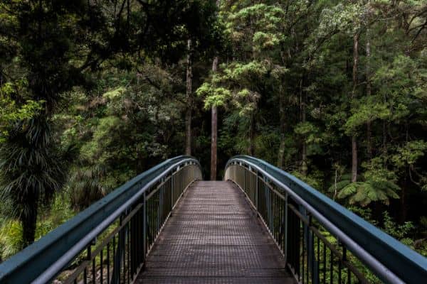
如何操作 - 响应式图片库
了解如何使用 CSS 创建响应式图库。
图片库
调整浏览器窗口大小以查看响应效果:
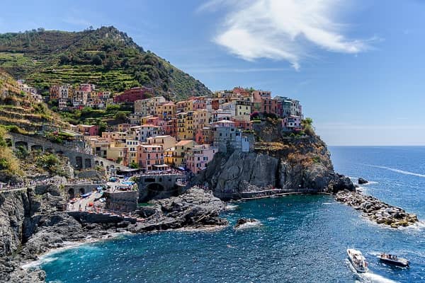
在此添加图片的描述
在此添加图片的描述

在此添加图片的描述

在此添加图片的描述
创建图片库
步骤1)添加HTML:
示例
<div class="responsive">
<div class="gallery">
<a target="_blank" href="img_5terre.jpg">
<img src="img_5terre.jpg" alt="Cinque Terre">
</a>
<div class="desc">Add a description of the image here</div>
</div>
</div>
<div class="responsive">
<div class="gallery">
<a target="_blank" href="img_forest.jpg">
<img src="img_forest.jpg" alt="Forest">
</a>
<div class="desc">Add a description of the image here</div>
</div>
</div>
<div class="responsive">
<div class="gallery">
<a target="_blank" href="img_lights.jpg">
<img src="img_lights.jpg" alt="Northern Lights">
</a>
<div class="desc">Add a description of the image here</div>
</div>
</div>
<div class="responsive">
<div class="gallery">
<a target="_blank" href="img_mountains.jpg">
<img src="img_mountains.jpg" alt="Mountains">
</a>
<div class="desc">Add a description of the image here</div>
</div>
</div>
<div class="clearfix"></div>
步骤2)添加CSS:
此示例使用媒体查询在不同屏幕尺寸上重新排列图片:对于大于 700 像素宽的屏幕,它将并排显示四个图片,对于小于 700 像素的屏幕,它将并排显示两个图片。对于小于 500 像素的屏幕,图片将垂直堆叠 (100%):
示例
div.gallery {
border: 1px solid #ccc;
}
div.gallery:hover {
border: 1px solid #777;
}
div.gallery img {
width: 100%;
height: auto;
}
div.desc {
padding: 15px;
text-align: center;
}
* {
box-sizing: border-box;
}
.responsive {
padding: 0 6px;
float: left;
width: 24.99999%;
}
@media only screen and (max-width: 700px) {
.responsive {
width: 49.99999%;
margin: 6px 0;
}
}
@media only screen and (max-width: 500px) {
.responsive {
width: 100%;
}
}
.clearfix:after {
content: "";
display: table;
clear: both;
}
亲自试一试 »
提示:去我们的HTML 图片教程了解有关图片的更多信息。
提示:去我们的CSS 样式图片教程了解有关如何设置图片样式的更多信息。
截取页面反馈部分,让我们更快修复内容!也可以直接跳过填写反馈内容!