- 如何使用
-
菜单
- 图标栏
- 菜单图标
- 手风琴
- 标签页
- 垂直标签页
- 标签页头部
- 全页标签页
- 悬停标签页
- 顶部导航
- 响应式顶部导航
- 分割导航
- 带图标的导航栏
- 搜索菜单
- 搜索栏
- 固定侧边栏
- 侧边导航
- 响应式侧边栏
- 全屏导航
- 画布外菜单
- 悬停侧边栏按钮
- 带图标的侧边栏
- 水平滚动菜单
- 垂直菜单
- 底部导航
- 响应式底部导航
- 底部边框导航链接
- 右对齐菜单链接
- 居中菜单链接
- 等宽菜单链接
- 固定菜单
- 滚动时下滑栏
- 滚动时隐藏导航栏
- 滚动时收缩导航栏
- 粘性导航栏
- 图片上的导航栏
- 悬停下拉菜单
- 点击下拉菜单
- 级联下拉菜单
- 顶部导航中的下拉菜单
- 侧边导航中的下拉菜单
- 响应式导航栏下拉菜单
- 子导航菜单
- 向上弹出菜单
- 巨型菜单
- 移动菜单
- 幕布菜单
- 折叠侧边栏
- 折叠侧面板
- 分页
- 面包屑
- 按钮组
- 垂直按钮组
- 粘性社交栏
- 胶囊导航
- 响应式头部
- 图片
- 按钮
- 表单
- 过滤器
- 表格
-
更多
- 全屏视频
- 模态框
- 删除模态框
- 时间线
- 滚动指示器
- 进度条
- 技能条
- 范围滑块
- 颜色选择器
- 电子邮件字段
- 工具提示
- 悬停显示元素
- 弹出窗口
- 可折叠元素
- 日历
- HTML 包含
- 待办事项列表
- 加载器
- 徽章
- 星级评分
- 用户评分
- 覆盖效果
- 联系人芯片
- 卡片
- 翻转卡片
- 个人资料卡片
- 产品卡片
- 警告
- 提示框
- 笔记
- 标签
- 丝带
- 标签云
- 圆形
- 样式 HR
- 优惠券
- 列表组
- 带徽章的列表组
- 无项目符号列表
- 响应式文本
- 剪影文本
- 发光文本
- 固定页脚
- 粘性元素
- 等高元素
- Clearfix
- 响应式浮动
- Snackbar
- 全屏窗口
- 滚动绘图
- 平滑滚动
- 渐变背景滚动
- 粘性头部
- 滚动时缩小头部
- 定价表
- 视差效果
- 宽高比
- 响应式 Iframes
- 切换喜欢/不喜欢
- 切换隐藏/显示
- 切换深色模式
- 切换文本
- 切换类别
- 添加类别
- 删除类别
- 更改类别
- 活动类别
- 树形视图
- 删除小数
- 删除属性
- 离线检测
- 查找隐藏元素
- 重定向网页
- 格式化数字
- 悬停缩放
- 翻转盒子
- 垂直居中
- 居中按钮在 DIV 中
- 居中列表
- 悬停过渡
- 箭头
- 形状
- 下载链接
- 全高元素
- 浏览器窗口
- 自定义滚动条
- 隐藏滚动条
- 显示/强制滚动条
- 设备外观
- 可编辑内容边框
- 占位符颜色
- 禁止调整文本区域大小
- 禁止文本选择
- 文本选择颜色
- 项目符号颜色
- 垂直线
- 分隔符
- 文本分隔符
- 动画图标
- 倒计时定时器
- 打字机效果
- 即将推出的页面
- 聊天消息
- 弹出聊天窗口
- 分屏
- 推荐语
- 部分计数器
- 引用幻灯片
- 可关闭列表项
- 典型设备断点
- 可拖动的 HTML 元素
- JS 媒体查询
- 语法高亮器
- JS 动画
- JS 字符串长度
- JS 指数运算
- JS 默认参数
- JS 随机数字
- JS 排序数字数组
- JS 扩展运算符
- JS 滚动到视图
- 获取当前日期
- 获取当前 URL
- 获取当前屏幕大小
- 获取 Iframe 元素
- 网站
- 网格
- 谷歌
- 转换器
- 博客
如何制作网站
了解如何创建适用于所有设备(PC、笔记本电脑、平板电脑和手机)的响应式网站。
从头开始创建一个网站
一个"Layout Draft"
在创建网站之前绘制页面设计的布局草稿是明智的做法:
导航栏
侧面内容
一些文字一些文字..
主要内容
一些文字一些文字..
一些文字一些文字..
一些文字一些文字..
页脚
第一步 - 基本 HTML 页面
HTML 是创建网站的标准标记语言,CSS 是描述 HTML 文档样式的语言。我们将结合 HTML 和 CSS 来创建一个基本的网页。
笔记:如果您不懂 HTML 和 CSS,我们建议您首先阅读我们的 HTML 教程。
示例
<!DOCTYPE html>
<html lang="en">
<head>
<title>Page Title</title>
<meta charset="UTF-8">
<meta name="viewport" content="width=device-width, initial-scale=1">
<style>
body {
font-family: Arial, Helvetica, sans-serif;
}
</style>
</head>
<body>
<h1>My Website</h1>
<p>A website created by me.</p>
</body>
</html>
亲自试一试 »
示例解释
- 这个
<!DOCTYPE html>声明将此文档定义为 HTML5 - 这个
<html>element 是 HTML 页面的根元素 - 这个
<head>元素包含有关文档的元信息 - 这个
<title>元素指定文档的标题 - 这个
<meta>元素应将字符集定义为 UTF-8 - 这个
<meta>name="viewport" 的元素使网站在所有设备和屏幕分辨率上看起来都很好 - 这个
<style>元素包含网站的样式(布局/设计) - 这个
<body>元素包含可见的页面内容 - 这个
<h1>元素定义一个大标题 - 这个
<p>元素定义一个段落
创建页面内容
在 - 的里面<body>在我们网站的元素中,我们将使用 "Layout Draft" 并创建:
- 一个标题
- 一个导航栏
- 主要内容
- 侧面内容
- 页脚
标头
标题通常位于网站的顶部(或顶部导航菜单的正下方)。它通常包含徽标或网站名称:
<div class="header">
<h1>My Website</h1>
<p>A website created by me.</p>
</div>
然后我们使用 CSS 来设置标题的样式:
.header {
padding: 80px; /* some padding */
text-align: center; /* center the text */
background: #1abc9c; /* green background */
color: white; /* white text color */
}
/* Increase the font size of the <h1> element */
.header h1 {
font-size: 40px;
}
导航栏
导航栏包含一系列链接,可帮助访问者浏览您的网站:
<div class="navbar">
<a href="#">Link</a>
<a href="#">Link</a>
<a href="#">Link</a>
<a href="#" class="right">Link</a>
</div>
使用 CSS 设置导航栏样式:
/* Style the top navigation bar */
.navbar {
overflow: hidden; /* Hide overflow */
background-color: #333; /* Dark background color */
}
/* Style the navigation bar links */
.navbar a {
float: left; /* Make sure that the links stay side-by-side */
display: block; /* Change the display to block, for responsive reasons (see below) */
color: white; /* White text color */
text-align: center; /* Center the text */
padding: 14px 20px; /* Add some padding */
text-decoration: none; /* Remove underline */
}
/* Right-aligned link */
.navbar a.right {
float: right; /* Float a link to the right */
}
/* Change color on hover/mouse-over */
.navbar a:hover {
background-color: #ddd; /* Grey background color */
color: black; /* Black text color */
}
内容
创建一个 2 列布局,分为 "side content" 和 "main content"。
<div class="row">
<div class="side">...</div>
<div class="main">...</div>
</div>
我们使用 CSS Flexbox 来处理布局:
/* Ensure proper sizing */
* {
box-sizing: border-box;
}
/* Column container */
.row {
display: flex;
flex-wrap: wrap;
}
/* Create two unequal columns that sits next to each other */
/* Sidebar/left column */
.side {
flex: 30%; /* Set the width of the sidebar */
background-color: #f1f1f1; /* Grey background color */
padding: 20px; /* Some padding */
}
/* Main column */
.main {
flex: 70%; /* Set the width of the main content */
background-color: white; /* White background color */
padding: 20px; /* Some padding */
}
然后添加媒体查询以使布局响应。这将确保您的网站在所有设备(台式机、笔记本电脑、平板电脑和手机)上看起来都不错。调整浏览器窗口大小以查看结果。
/* Responsive layout - when the screen is less than 700px wide, make the two columns stack on top of each other instead of next to each other */
@media screen and (max-width: 700px) {
.row {
flex-direction: column;
}
}
/* Responsive layout - when the screen is less than 400px wide, make the navigation links stack on top of each other instead of next to each other */
@media screen and (max-width: 400px) {
.navbar a {
float: none;
width: 100%;
}
}
提示:要创建不同类型的布局,只需更改 Flex 宽度(但确保其加起来为 100%)。
提示:您想知道@media 规则如何运作吗?在我们的 CSS 媒体查询章节中阅读更多相关内容。
提示:要了解有关灵活框布局模块的更多信息,阅读我们的 CSS Flexbox 章节。
什么是盒子尺寸?
您可以轻松地并排创建三个浮动框。但是,当您添加一些东西来扩大每个框的宽度(例如内边距或边框)时,框就会破裂。这box-sizing属性允许我们将内边距和边框包含在框的总宽度(和高度)中,确保内边距保留在框内并且不会破坏。
您可以在我们的文章中阅读有关 box-sizing 属性的更多信息CSS 框大小调整教程。
页脚
最后,我们将添加页脚。
<div class="footer">
<h2>Footer</h2>
</div>
并设计它的样式:
.footer {
padding: 20px; /* Some padding */
text-align: center; /* Center text*/
background: #ddd; /* Grey background */
}
恭喜!您从头开始构建了一个响应式网站。
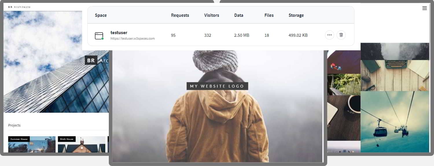
91xjr 空间
如果您想创建自己的网站并托管 .html 文件,请尝试我们的网站建设者,称为W3schools 空间:
截取页面反馈部分,让我们更快修复内容!也可以直接跳过填写反馈内容!