数据科学 - 回归表:R 平方
R-平方
R-Squared 和调整后的 R-Squared 描述了线性回归模型对数据点的拟合程度:
R-Squared 的值始终在 0 到 1(0% 到 100%)之间。
- 高 R 平方值意味着许多数据点接近线性回归函数线。
- R 平方值较低意味着线性回归函数线不能很好地拟合数据。
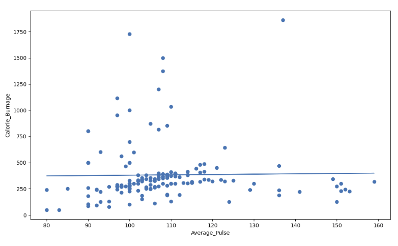
低 R 平方值 (0.00) 的视觉示例
我们的回归模型显示 R 平方值为零,这意味着线性回归函数线不能很好地拟合数据。
当我们通过 Average_Pulse 和 Calorie_Burnage 的数据点绘制线性回归函数时,可以将这一点可视化。
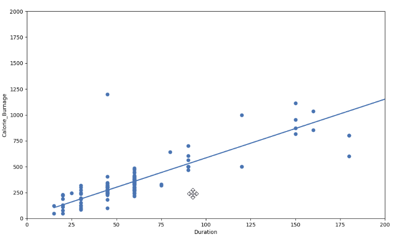
高 R 平方值 (0.79) 的视觉示例
然而,如果我们绘制期间和卡路里_燃烧,R 方增加。在这里,我们看到数据点接近线性回归函数线:
这是 Python 中的代码:
示例
import pandas as pd
import matplotlib.pyplot as plt
from scipy import stats
full_health_data = pd.read_csv("data.csv", header=0, sep=",")
x = full_health_data["Duration"]
y = full_health_data ["Calorie_Burnage"]
slope, intercept, r, p, std_err = stats.linregress(x, y)
def myfunc(x):
return slope * x + intercept
mymodel = list(map(myfunc, x))
print(mymodel)
plt.scatter(x, y)
plt.plot(x, mymodel)
plt.ylim(ymin=0, ymax=2000)
plt.xlim(xmin=0, xmax=200)
plt.xlabel("Duration")
plt.ylabel ("Calorie_Burnage")
plt.show()
亲自试一试 »
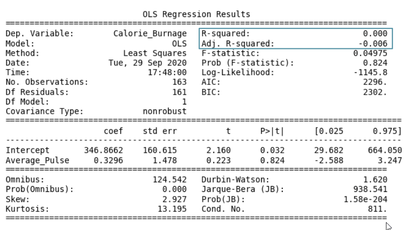
摘要 - 使用 Average_Pulse 预测 Calorie_Burnage
我们如何总结以 Average_Pulse 作为解释变量的线性回归函数?
- 系数为 0.3296,这意味着 Average_Pulse 对 Calorie_Burnage 的影响非常小。
- 高 P 值 (0.824),这意味着我们无法得出 Average_Pulse 和 Calorie_Burnage 之间的关系。
- R-Squared 值为 0,这意味着线性回归函数线不能很好地拟合数据。
截取页面反馈部分,让我们更快修复内容!也可以直接跳过填写反馈内容!