主要内容
目录
-
HTML 教程
- HTML 主页
- HTML 简介
- HTML 编辑器
- HTML 基础
- HTML 元素
- HTML 属性
- HTML 标题
- HTML 段落
- HTML 样式
- HTML 格式化
- HTML 引用
- HTML 注释
- HTML 颜色
- HTML CSS
- HTML 链接
- HTML 图像
- HTML Favicon
- HTML 页面标题
- HTML 表格
- HTML 列表
- HTML 块与行内
- HTML Div
- HTML 类
- HTML Id
- HTML Iframes
- HTML JavaScript
- HTML 文件路径
- HTML 头部
- HTML 布局
- HTML 响应式
- HTML 计算机代码
- HTML 语义
- HTML 风格指南
- HTML 实体
- HTML 符号
- HTML 表情
- HTML 字符集
- HTML URL 编码
- HTML 与 XHTML
- HTML 表单
- HTML 图形
- HTML 媒体
- HTML API
- HTML 示例
- HTML 参考
HTML 响应式网页设计
响应式网页设计是为了创建在所有设备上看起来都不错的网页!
响应式网页设计将自动调整以适应不同的屏幕尺寸和视口。
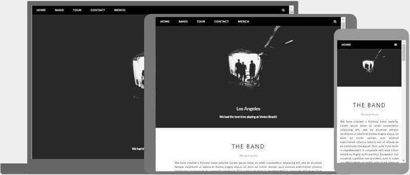
什么是响应式网页设计?
响应式网页设计是指使用 HTML 和 CSS 自动调整、隐藏、缩小或放大网站的大小,使其在所有设备(台式机、平板电脑和手机)上看起来都很好:
设置视口
要创建响应式网站,请添加以下内容<meta>标记到您的所有网页:
这将设置页面的视口,这将为浏览器提供有关如何控制页面尺寸和缩放的说明。
这是一个网页示例没有视口元标记和相同的网页和视口元标记:
没有视口元标记:
使用视口元标记:

提示:如果您在手机或平板电脑上浏览此页面,可以点击上面的两个链接来查看差异。
响应式图像
响应式图像是可以很好地缩放以适应任何浏览器尺寸的图像。
使用宽度属性
如果CSSwidth属性设置为 100%,图像将响应并放大和缩小:

请注意,在上面的示例中,图像可以放大到大于其原始尺寸。在许多情况下,更好的解决方案是使用max-width属性代替。
使用 max-width 属性
如果max-width属性设置为 100%,图像将在必要时缩小,但永远不会放大到大于其原始大小:
根据浏览器宽度显示不同的图像
HTML<picture>元素允许您为不同的浏览器窗口大小定义不同的图像。
调整浏览器窗口的大小以查看下面的图像如何根据宽度变化:

示例
<picture>
<source srcset="img_smallflower.jpg" media="(max-width: 600px)">
<source srcset="img_flowers.jpg" media="(max-width: 1500px)">
<source srcset="flowers.jpg">
<img src="img_smallflower.jpg" alt="Flowers">
</picture>
亲自试一试 »
响应式文本大小
文字大小可以用"vw"单位设置,即"viewport width"。
这样,文本大小将跟随浏览器窗口的大小:
你好世界
调整浏览器窗口大小以查看文本大小如何缩放。
视口是浏览器窗口的大小。 1vw = 视口宽度的 1%。如果视口宽 50 厘米,则 1vw 为 0.5 厘米。
媒体查询
除了调整文本和图像的大小之外,在响应式网页中使用媒体查询也很常见。
通过媒体查询,您可以为不同的浏览器尺寸定义完全不同的样式。
示例:调整浏览器窗口大小,可以看到下面的三个 div 元素将在大屏幕上水平显示,并在小屏幕上垂直堆叠:
左侧菜单
正确的内容
示例
<style>
.left, .right {
float: left;
width: 20%; /* The width is 20%, by default */
}
.main {
float: left;
width: 60%; /* The width is 60%, by default */
}
/* Use a media query to add a breakpoint at 800px: */
@media screen and (max-width: 800px) {
.left, .main, .right {
width: 100%; /* The width is 100%, when the viewport is 800px or smaller */
}
}
</style>
亲自试一试 »
提示:要了解有关媒体查询和响应式网页设计的更多信息,请阅读我们的后轮驱动教程。
响应式网页 - 完整示例
响应式网页应该在大型桌面屏幕和小型手机上看起来不错。
响应式网页设计 - 框架
所有流行的 CSS 框架都提供响应式设计。
它们是免费的,并且易于使用。
W3.CSS
W3.CSS 是一个现代 CSS 框架,默认支持桌面、平板电脑和移动设计。
W3.CSS 比类似的 CSS 框架更小、更快。
W3.CSS 被设计为独立于 jQuery 或任何其他 JavaScript 库。
W3.CSS演示
调整页面大小以查看响应能力!
伦敦
伦敦是英格兰的首都。
它是英国人口最多的城市,大都市区人口超过 1300 万。
巴黎
巴黎是法国的首都。
巴黎地区是欧洲最大的人口中心之一,拥有超过 1200 万居民。
东京
东京是日本的首都。
它是大东京地区的中心,也是世界上人口最多的都市区。
示例
<!DOCTYPE html>
<html>
<meta name="viewport" content="width=device-width, initial-scale=1">
<link rel="stylesheet" href="https://www.91xjr.com/w3css/4/w3.css">
<body>
<div class="w3-container w3-green">
<h1>91xjr Demo</h1>
<p>Resize this responsive page!</p>
</div>
<div class="w3-row-padding">
<div class="w3-third">
<h2>London</h2>
<p>London is the capital city of England.</p>
<p>It is the most populous city in the United Kingdom,
with a metropolitan area of over 13 million inhabitants.</p>
</div>
<div class="w3-third">
<h2>Paris</h2>
<p>Paris is the capital of France.</p>
<p>The Paris area is one of the largest population centers in Europe,
with more than 12 million inhabitants.</p>
</div>
<div class="w3-third">
<h2>Tokyo</h2>
<p>Tokyo is the capital of Japan.</p>
<p>It is the center of the Greater Tokyo Area,
and the most populous metropolitan area in the world.</p>
</div>
</div>
</body>
</html>
亲自试一试 »
要了解有关 W3.CSS 的更多信息,请阅读我们的W3.CSS教程。
Bootstrap
另一个流行的 CSS 框架是 Bootstrap:
示例
<!DOCTYPE html>
<html lang="en">
<head>
<title>Bootstrap 5 Example</title>
<meta charset="utf-8">
<meta name="viewport" content="width=device-width, initial-scale=1">
<link href="https://cdn.jsdelivr.net/npm/bootstrap@5.2.3/dist/css/bootstrap.min.css" rel="stylesheet">
<script src="https://cdn.jsdelivr.net/npm/bootstrap@5.2.3/dist/js/bootstrap.bundle.min.js"></script>
</head>
<body>
<div class="container-fluid p-5 bg-primary text-white text-center">
<h1>My First Bootstrap Page</h1>
<p>Resize this responsive page to see the effect!</p>
</div>
<div class="container mt-5">
<div class="row">
<div class="col-sm-4">
<h3>Column 1</h3>
<p>Lorem ipsum...</p>
</div>
<div class="col-sm-4">
<h3>Column 2</h3>
<p>Lorem ipsum...</p>
</div>
<div class="col-sm-4">
<h3>Column 3</h3>
<p>Lorem ipsum...</p>
</div>
</div>
</div>
亲自试一试 »
要了解有关 Bootstrap 的更多信息,请访问我们的Bootstrap教程。
截取页面反馈部分,让我们更快修复内容!也可以直接跳过填写反馈内容!