目录
- HOW TO
-
Menus
- Icon Bar
- Menu Icon
- Accordion
- Tabs
- Vertical Tabs
- Tab Headers
- Full Page Tabs
- Hover Tabs
- Top Navigation
- Responsive Topnav
- Split Navigation
- Navbar with Icons
- Search Menu
- Search Bar
- Fixed Sidebar
- Side Navigation
- Responsive Sidebar
- Fullscreen Navigation
- Off-Canvas Menu
- Hover Sidenav Buttons
- Sidebar with Icons
- Horizontal Scroll Menu
- Vertical Menu
- Bottom Navigation
- Responsive Bottom Nav
- Bottom Border Nav Links
- Right Aligned Menu Links
- Centered Menu Link
- Equal Width Menu Links
- Fixed Menu
- Slide Down Bar on Scroll
- Hide Navbar on Scroll
- Shrink Navbar on Scroll
- Sticky Navbar
- Navbar on Image
- Hover Dropdowns
- Click Dropdowns
- Cascading Dropdown
- Dropdown in Topnav
- Dropdown in Sidenav
- Resp Navbar Dropdown
- Subnavigation Menu
- Dropup
- Mega Menu
- Mobile Menu
- Curtain Menu
- Collapsed Sidebar
- Collapsed Sidepanel
- Pagination
- Breadcrumbs
- Button Group
- Vertical Button Group
- Sticky Social Bar
- Pill Navigation
- Responsive Header
-
Images
- Slideshow
- Slideshow Gallery
- Modal Images
- Lightbox
- Responsive Image Grid
- Image Grid
- Image Gallery
- Scrollable Image Gallery
- Tab Gallery
- Image Overlay Fade
- Image Overlay Slide
- Image Overlay Zoom
- Image Overlay Title
- Image Overlay Icon
- Image Effects
- Black and White Image
- Image Text
- Image Text Blocks
- Transparent Image Text
- Full Page Image
- Form on Image
- Hero Image
- Blur Background Image
- Change Bg on Scroll
- Side-by-Side Images
- Rounded Images
- Avatar Images
- Responsive Images
- Center Images
- Thumbnails
- Border Around Image
- Meet the Team
- Sticky Image
- Flip an Image
- Shake an Image
- Portfolio Gallery
- Portfolio with Filtering
- Image Zoom
- Image Magnifier Glass
- Image Comparison Slider
- Favicon
-
Buttons
- Alert Buttons
- Outline Buttons
- Split Buttons
- Animated Buttons
- Fading Buttons
- Button on Image
- Social Media Buttons
- Read More Read Less
- Loading Buttons
- Download Buttons
- Pill Buttons
- Notification Button
- Icon Buttons
- Next/prev Buttons
- More Button in Nav
- Block Buttons
- Text Buttons
- Round Buttons
- Scroll To Top Button
-
Forms
- Login Form
- Signup Form
- Checkout Form
- Contact Form
- Social Login Form
- Register Form
- Form with Icons
- Newsletter
- Stacked Form
- Responsive Form
- Popup Form
- Inline Form
- Clear Input Field
- Hide Number Arrows
- Copy Text to Clipboard
- Animated Search
- Search Button
- Fullscreen Search
- Input Field in Navbar
- Login Form in Navbar
- Custom Checkbox/Radio
- Custom Select
- Toggle Switch
- Check Checkbox
- Detect Caps Lock
- Trigger Button on Enter
- Password Validation
- Toggle Password Visibility
- Multiple Step Form
- Autocomplete
- Turn off autocomplete
- Turn off spellcheck
- File Upload Button
- Empty Input Validation
- Filters
- Tables
-
More
- Fullscreen Video
- Modal Boxes
- Delete Modal
- Timeline
- Scroll Indicator
- Progress Bars
- Skill Bar
- Range Sliders
- Color Picker
- Email Field
- Tooltips
- Display Element Hover
- Popups
- Collapsible
- Calendar
- HTML Includes
- To Do List
- Loaders
- Badges
- Star Rating
- User Rating
- Overlay Effect
- Contact Chips
- Cards
- Flip Card
- Profile Card
- Product Card
- Alerts
- Callout
- Notes
- Labels
- Ribbon
- Tag Cloud
- Circles
- Style HR
- Coupon
- List Group
- List Group with Badges
- List Without Bullets
- Responsive Text
- Cutout Text
- Glowing Text
- Fixed Footer
- Sticky Element
- Equal Height
- Clearfix
- Responsive Floats
- Snackbar
- Fullscreen Window
- Scroll Drawing
- Smooth Scroll
- Gradient Bg Scroll
- Sticky Header
- Shrink Header on Scroll
- Pricing Table
- Parallax
- Aspect Ratio
- Responsive Iframes
- Toggle Like/Dislike
- Toggle Hide/Show
- Toggle Dark Mode
- Toggle Text
- Toggle Class
- Add Class
- Remove Class
- Change Class
- Active Class
- Tree View
- Remove Decimals
- Remove Property
- Offline Detection
- Find Hidden Element
- Redirect Webpage
- Format a Number
- Zoom Hover
- Flip Box
- Center Vertically
- Center Button in DIV
- Center a List
- Transition on Hover
- Arrows
- Shapes
- Download Link
- Full Height Element
- Browser Window
- Custom Scrollbar
- Hide Scrollbar
- Show/Force Scrollbar
- Device Look
- Contenteditable Border
- Placeholder Color
- Disable Resizing of Textarea
- Disable Text Selection
- Text Selection Color
- Bullet Color
- Vertical Line
- Dividers
- Text Divider
- Animate Icons
- Countdown Timer
- Typewriter
- Coming Soon Page
- Chat Messages
- Popup Chat Window
- Split Screen
- Testimonials
- Section Counter
- Quotes Slideshow
- Closable List Items
- Typical Device Breakpoints
- Draggable HTML Element
- JS Media Queries
- Syntax Highlighter
- JS Animations
- JS String Length
- JS Exponentiation
- JS Default Parameters
- JS Random Number
- JS Sort Numeric Array
- JS Spread Operator
- JS Scroll Into View
- Get Current Date
- Get Current URL
- Get Current Screen Size
- Get Iframe Elements
-
Website
- Create a Free Website
- Make a Website
- Make a Static Website
- Host a Static Website
- Make a Website (W3.CSS)
- Make a Website (BS3)
- Make a Website (BS4)
- Make a Website (BS5)
- Create and View a Website
- Create a Link Tree Website
- Create a Portfolio
- Create a Resume
- Make a Restaurant Website
- Make a Business Website
- Make a WebBook
- Center Website
- Contact Section
- About Page
- Big Header
- Example Website
- Grid
- Converters
- Blog
How TO - Responsive Image Gallery
Learn how to create a responsive image gallery with CSS.
Image Gallery
Resize the browser window to see the responsive effect:
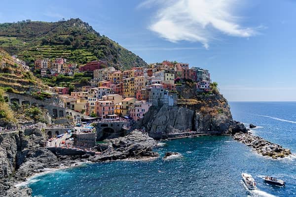
Add a description of the image here
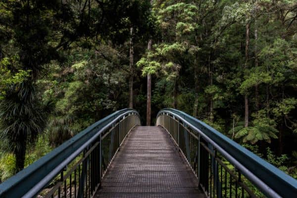
Add a description of the image here

Add a description of the image here

Add a description of the image here
Create a Image Gallery
Step 1) Add HTML:
Example
<div class="responsive">
<div class="gallery">
<a target="_blank" href="img_5terre.jpg">
<img src="img_5terre.jpg" alt="Cinque Terre">
</a>
<div class="desc">Add a description of the image here</div>
</div>
</div>
<div class="responsive">
<div class="gallery">
<a target="_blank" href="img_forest.jpg">
<img src="img_forest.jpg" alt="Forest">
</a>
<div class="desc">Add a description of the image here</div>
</div>
</div>
<div class="responsive">
<div class="gallery">
<a target="_blank" href="img_lights.jpg">
<img src="img_lights.jpg" alt="Northern Lights">
</a>
<div class="desc">Add a description of the image here</div>
</div>
</div>
<div class="responsive">
<div class="gallery">
<a target="_blank" href="img_mountains.jpg">
<img src="img_mountains.jpg" alt="Mountains">
</a>
<div class="desc">Add a description of the image here</div>
</div>
</div>
<div class="clearfix"></div>
Step 2) Add CSS:
This example use media queries to re-arrange the images on different screen sizes: for screens larger than 700px wide, it will show four images side by side, for screens smaller than 700px, it will show two images side by side. For screens smaller than 500px, the images will stack vertically (100%):
Example
div.gallery {
border: 1px solid #ccc;
}
div.gallery:hover {
border: 1px solid #777;
}
div.gallery img {
width: 100%;
height: auto;
}
div.desc {
padding: 15px;
text-align: center;
}
* {
box-sizing: border-box;
}
.responsive {
padding: 0 6px;
float: left;
width: 24.99999%;
}
@media only screen and (max-width: 700px) {
.responsive {
width: 49.99999%;
margin: 6px 0;
}
}
@media only screen and (max-width: 500px) {
.responsive {
width: 100%;
}
}
.clearfix:after {
content: "";
display: table;
clear: both;
}
Try it Yourself »
Tip: Go to our HTML Images Tutorial to learn more about images.
Tip: Go to our CSS Style Images Tutorial to learn more about how to style images.
截取页面反馈部分,让我们更快修复内容!也可以直接跳过填写反馈内容!