R Bar Charts
Bar Charts
A bar chart uses rectangular bars to visualize data. Bar charts can be displayed horizontally or vertically. The height or length of the bars are proportional to the values they represent.
Use the barplot() function to draw a vertical bar chart:
Example
# x-axis values
x <- c("A", "B", "C", "D")
# y-axis values
y <- c(2, 4, 6, 8)
barplot(y, names.arg = x)
Result:
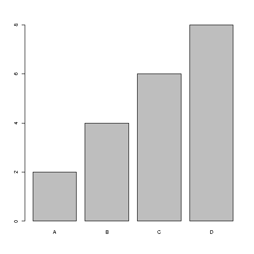
Example Explained
- The
xvariable represents values in the x-axis (A,B,C,D) - The
yvariable represents values in the y-axis (2,4,6,8) - Then we use the
barplot()function to create a bar chart of the values names.argdefines the names of each observation in the x-axis
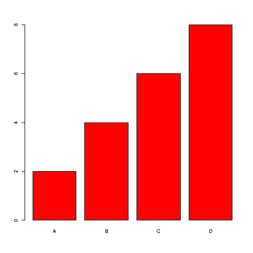
Bar Color
Use the col parameter to change the color of the bars:
Example
x <- c("A", "B", "C", "D")
y <- c(2, 4, 6, 8)
barplot(y, names.arg = x, col = "red")
Result:
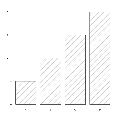
Density / Bar Texture
To change the bar texture, use the density parameter:
Example
x <- c("A", "B", "C", "D")
y <- c(2, 4, 6, 8)
barplot(y, names.arg = x, density = 10)
Result:
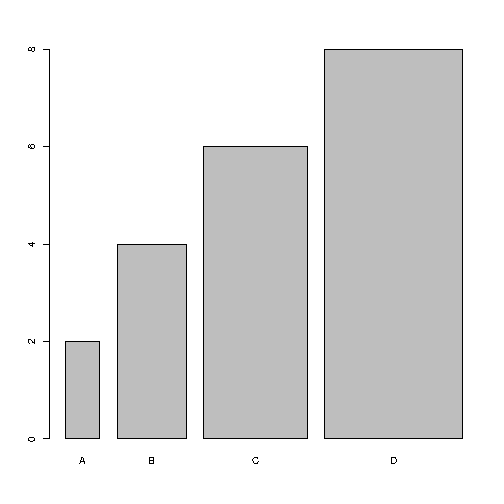
Bar Width
Use the width parameter to change the width of the bars:
Example
x <- c("A", "B", "C", "D")
y <- c(2, 4, 6, 8)
barplot(y, names.arg = x, width = c(1,2,3,4))
Result:
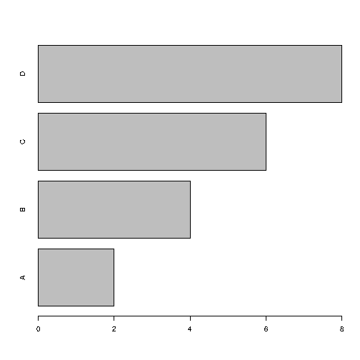
Horizontal Bars
If you want the bars to be displayed horizontally instead of vertically, use horiz=TRUE:
Example
x <- c("A", "B", "C", "D")
y <- c(2, 4, 6, 8)
barplot(y, names.arg = x, horiz = TRUE)
Result:
截取页面反馈部分,让我们更快修复内容!也可以直接跳过填写反馈内容!