-
Python Tutorial
- Python HOME
- Python Intro
- Python Get Started
- Python Syntax
- Python Comments
- Python Variables
- Python Data Types
- Python Numbers
- Python Casting
- Python Strings
- Python Booleans
- Python Operators
- Python Lists
- Python Tuples
- Python Sets
- Python Dictionaries
- Python If...Else
- Python While Loops
- Python For Loops
- Python Functions
- Python Lambda
- Python Arrays
- Python Classes/Objects
- Python Inheritance
- Python Iterators
- Python Polymorphism
- Python Scope
- Python Modules
- Python Dates
- Python Math
- Python JSON
- Python RegEx
- Python PIP
- Python Try...Except
- Python User Input
- Python String Formatting
- File Handling
- Python Modules
- Python Matplotlib
-
Machine Learning
- Getting Started
- Mean Median Mode
- Standard Deviation
- Percentile
- Data Distribution
- Normal Data Distribution
- Scatter Plot
- Linear Regression
- Polynomial Regression
- Multiple Regression
- Scale
- Train/Test
- Decision Tree
- Confusion Matrix
- Hierarchical Clustering
- Logistic Regression
- Grid Search
- Categorical Data
- K-means
- Bootstrap Aggregation
- Cross Validation
- AUC - ROC Curve
- K-nearest neighbors
- Python MySQL
- Python MongoDB
- Python Reference
- Module Reference
- Python How To
- Python Examples
Machine Learning - Scatter Plot
Scatter Plot
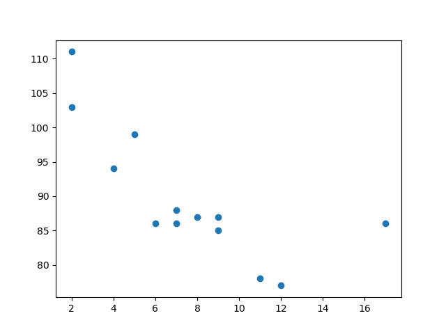
A scatter plot is a diagram where each value in the data set is represented by a dot.

The Matplotlib module has a method for drawing scatter plots, it needs two arrays of the same length, one for the values of the x-axis, and one for the values of the y-axis:
x = [5,7,8,7,2,17,2,9,4,11,12,9,6]
y = [99,86,87,88,111,86,103,87,94,78,77,85,86]
The x array represents the age of each car.
The y array represents the speed of each car.
Example
Use the scatter() method to draw a scatter plot diagram:
import matplotlib.pyplot as plt
x = [5,7,8,7,2,17,2,9,4,11,12,9,6]
y = [99,86,87,88,111,86,103,87,94,78,77,85,86]
plt.scatter(x, y)
plt.show()
Result:

Scatter Plot Explained
The x-axis represents ages, and the y-axis represents speeds.
What we can read from the diagram is that the two fastest cars were both 2 years old, and the slowest car was 12 years old.
Note: It seems that the newer the car, the faster it drives, but that could be a coincidence, after all we only registered 13 cars.
Random Data Distributions
In Machine Learning the data sets can contain thousands-, or even millions, of values.
You might not have real world data when you are testing an algorithm, you might have to use randomly generated values.
As we have learned in the previous chapter, the NumPy module can help us with that!
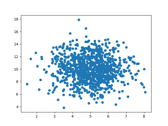
Let us create two arrays that are both filled with 1000 random numbers from a normal data distribution.
The first array will have the mean set to 5.0 with a standard deviation of 1.0.
The second array will have the mean set to 10.0 with a standard deviation of 2.0:
Example
A scatter plot with 1000 dots:
import numpy
import matplotlib.pyplot as plt
x = numpy.random.normal(5.0, 1.0, 1000)
y = numpy.random.normal(10.0, 2.0, 1000)
plt.scatter(x, y)
plt.show()
Result:

Scatter Plot Explained
We can see that the dots are concentrated around the value 5 on the x-axis, and 10 on the y-axis.
We can also see that the spread is wider on the y-axis than on the x-axis.
截取页面反馈部分,让我们更快修复内容!也可以直接跳过填写反馈内容!