-
Python Tutorial
- Python HOME
- Python Intro
- Python Get Started
- Python Syntax
- Python Comments
- Python Variables
- Python Data Types
- Python Numbers
- Python Casting
- Python Strings
- Python Booleans
- Python Operators
- Python Lists
- Python Tuples
- Python Sets
- Python Dictionaries
- Python If...Else
- Python While Loops
- Python For Loops
- Python Functions
- Python Lambda
- Python Arrays
- Python Classes/Objects
- Python Inheritance
- Python Iterators
- Python Polymorphism
- Python Scope
- Python Modules
- Python Dates
- Python Math
- Python JSON
- Python RegEx
- Python PIP
- Python Try...Except
- Python User Input
- Python String Formatting
- File Handling
- Python Modules
- Python Matplotlib
-
Machine Learning
- Getting Started
- Mean Median Mode
- Standard Deviation
- Percentile
- Data Distribution
- Normal Data Distribution
- Scatter Plot
- Linear Regression
- Polynomial Regression
- Multiple Regression
- Scale
- Train/Test
- Decision Tree
- Confusion Matrix
- Hierarchical Clustering
- Logistic Regression
- Grid Search
- Categorical Data
- K-means
- Bootstrap Aggregation
- Cross Validation
- AUC - ROC Curve
- K-nearest neighbors
- Python MySQL
- Python MongoDB
- Python Reference
- Module Reference
- Python How To
- Python Examples
Matplotlib Pie Charts
Creating Pie Charts
With Pyplot, you can use the pie() function to draw pie charts:
Example
A simple pie chart:
import matplotlib.pyplot as plt
import numpy as np
y = np.array([35, 25, 25, 15])
plt.pie(y)
plt.show()
Result:
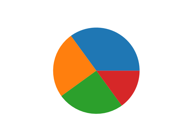
As you can see the pie chart draws one piece (called a wedge) for each value in the array (in this case [35, 25, 25, 15]).
By default the plotting of the first wedge starts from the x-axis and moves counterclockwise:
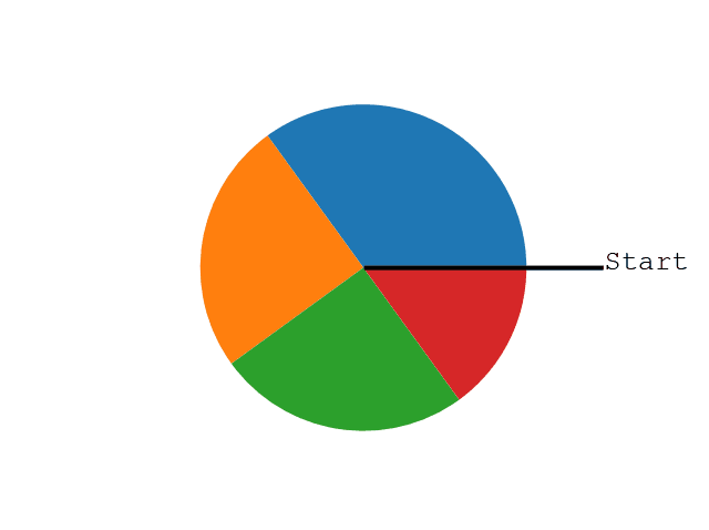
Note: The size of each wedge is determined by comparing the value with all the other values, by using this formula:
The value divided by the sum of all values: x/sum(x)
Labels
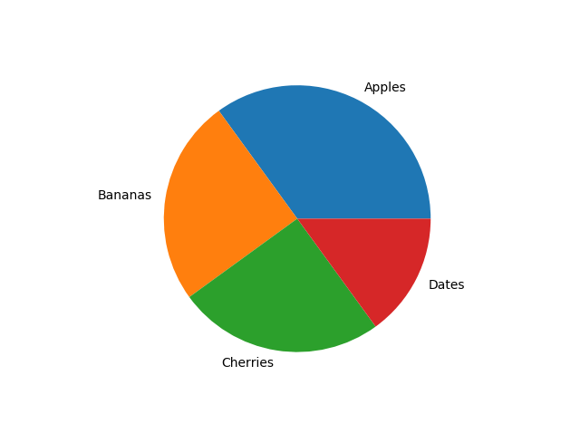
Add labels to the pie chart with the label parameter.
The label parameter must be an array with one label for each wedge:
Example
A simple pie chart:
import matplotlib.pyplot as plt
import numpy as np
y = np.array([35, 25, 25, 15])
mylabels = ["Apples", "Bananas", "Cherries", "Dates"]
plt.pie(y, labels = mylabels)
plt.show()
Result:
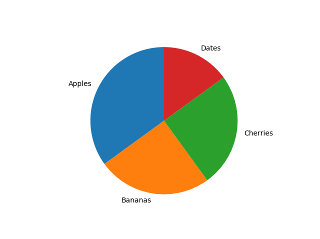
Start Angle
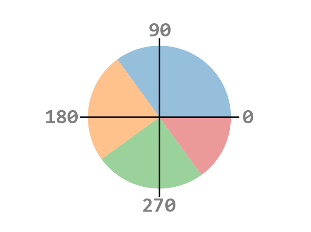
As mentioned the default start angle is at the x-axis, but you can change the start angle by specifying a startangle parameter.
The startangle parameter is defined with an angle in degrees, default angle is 0:
Example
Start the first wedge at 90 degrees:
import matplotlib.pyplot as plt
import numpy as np
y = np.array([35, 25, 25, 15])
mylabels = ["Apples", "Bananas", "Cherries", "Dates"]
plt.pie(y, labels = mylabels, startangle = 90)
plt.show()
Result:
Explode
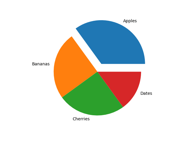
Maybe you want one of the wedges to stand out? The explode parameter allows you to do that.
The explode parameter, if specified, and not None, must be an array with one value for each wedge.
Each value represents how far from the center each wedge is displayed:
Example
Pull the "Apples" wedge 0.2 from the center of the pie:
import matplotlib.pyplot as plt
import numpy as np
y = np.array([35, 25, 25, 15])
mylabels = ["Apples", "Bananas", "Cherries", "Dates"]
myexplode = [0.2, 0, 0, 0]
plt.pie(y, labels = mylabels, explode = myexplode)
plt.show()
Result:
Shadow
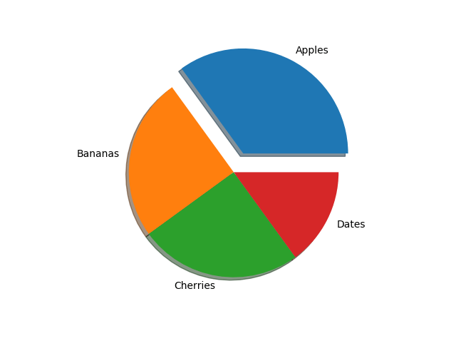
Add a shadow to the pie chart by setting the shadows parameter to True:
Example
Add a shadow:
import matplotlib.pyplot as plt
import numpy as np
y = np.array([35, 25, 25, 15])
mylabels = ["Apples", "Bananas", "Cherries", "Dates"]
myexplode = [0.2, 0, 0, 0]
plt.pie(y, labels = mylabels, explode = myexplode, shadow = True)
plt.show()
Result:
Colors
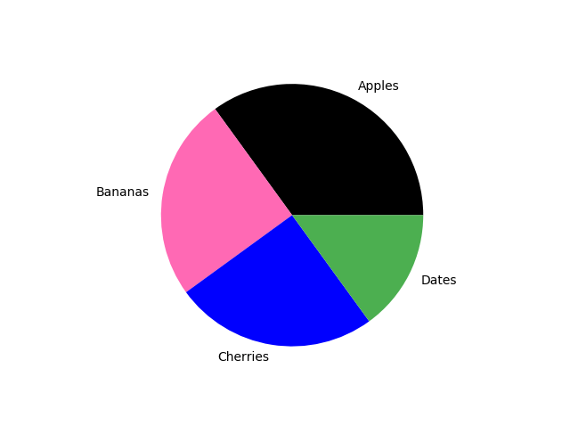
You can set the color of each wedge with the colors parameter.
The colors parameter, if specified, must be an array with one value for each wedge:
Example
Specify a new color for each wedge:
import matplotlib.pyplot as plt
import numpy as np
y = np.array([35, 25, 25, 15])
mylabels = ["Apples", "Bananas", "Cherries", "Dates"]
mycolors = ["black", "hotpink", "b", "#4CAF50"]
plt.pie(y, labels = mylabels, colors = mycolors)
plt.show()
Result:
You can use Hexadecimal color values, any of the 140 supported color names, or one of these shortcuts:
'r' - Red
'g' - Green
'b' - Blue
'c' - Cyan
'm' - Magenta
'y' - Yellow
'k' - Black
'w' - White
Legend
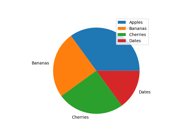
To add a list of explanation for each wedge, use the legend() function:
Example
Add a legend:
import matplotlib.pyplot as plt
import numpy as np
y = np.array([35, 25, 25, 15])
mylabels = ["Apples", "Bananas", "Cherries", "Dates"]
plt.pie(y, labels = mylabels)
plt.legend()
plt.show()
Result:
Legend With Header
To add a header to the legend, add the title parameter to the legend function.
Example
Add a legend with a header:
import matplotlib.pyplot as plt
import numpy as np
y = np.array([35, 25, 25, 15])
mylabels = ["Apples", "Bananas", "Cherries", "Dates"]
plt.pie(y, labels = mylabels)
plt.legend(title = "Four Fruits:")
plt.show()
Result:

截取页面反馈部分,让我们更快修复内容!也可以直接跳过填写反馈内容!