-
Python Tutorial
- Python HOME
- Python Intro
- Python Get Started
- Python Syntax
- Python Comments
- Python Variables
- Python Data Types
- Python Numbers
- Python Casting
- Python Strings
- Python Booleans
- Python Operators
- Python Lists
- Python Tuples
- Python Sets
- Python Dictionaries
- Python If...Else
- Python While Loops
- Python For Loops
- Python Functions
- Python Lambda
- Python Arrays
- Python Classes/Objects
- Python Inheritance
- Python Iterators
- Python Polymorphism
- Python Scope
- Python Modules
- Python Dates
- Python Math
- Python JSON
- Python RegEx
- Python PIP
- Python Try...Except
- Python User Input
- Python String Formatting
- File Handling
- Python Modules
- Python Matplotlib
-
Machine Learning
- Getting Started
- Mean Median Mode
- Standard Deviation
- Percentile
- Data Distribution
- Normal Data Distribution
- Scatter Plot
- Linear Regression
- Polynomial Regression
- Multiple Regression
- Scale
- Train/Test
- Decision Tree
- Confusion Matrix
- Hierarchical Clustering
- Logistic Regression
- Grid Search
- Categorical Data
- K-means
- Bootstrap Aggregation
- Cross Validation
- AUC - ROC Curve
- K-nearest neighbors
- Python MySQL
- Python MongoDB
- Python Reference
- Module Reference
- Python How To
- Python Examples
Machine Learning - Polynomial Regression
Polynomial Regression
If your data points clearly will not fit a linear regression (a straight line through all data points), it might be ideal for polynomial regression.
Polynomial regression, like linear regression, uses the relationship between the variables x and y to find the best way to draw a line through the data points.

How Does it Work?
Python has methods for finding a relationship between data-points and to draw a line of polynomial regression. We will show you how to use these methods instead of going through the mathematic formula.
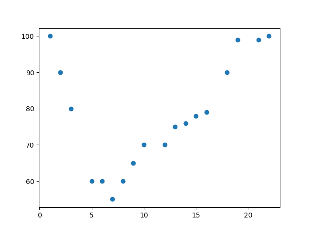
In the example below, we have registered 18 cars as they were passing a certain tollbooth.
We have registered the car's speed, and the time of day (hour) the passing occurred.
The x-axis represents the hours of the day and the y-axis represents the speed:
Example
Start by drawing a scatter plot:
import matplotlib.pyplot as plt
x = [1,2,3,5,6,7,8,9,10,12,13,14,15,16,18,19,21,22]
y = [100,90,80,60,60,55,60,65,70,70,75,76,78,79,90,99,99,100]
plt.scatter(x, y)
plt.show()
Result:

Example
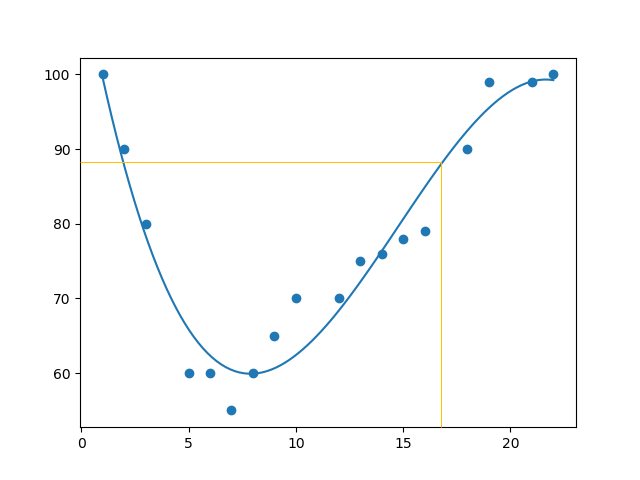
Import numpy and matplotlib then draw the line of Polynomial Regression:
import numpy
import matplotlib.pyplot as plt
 x = [1,2,3,5,6,7,8,9,10,12,13,14,15,16,18,19,21,22]
y = [100,90,80,60,60,55,60,65,70,70,75,76,78,79,90,99,99,100]
mymodel = numpy.poly1d(numpy.polyfit(x, y, 3))
myline = numpy.linspace(1, 22, 100)
plt.scatter(x, y)
plt.plot(myline, mymodel(myline))
plt.show()
Result:

Example Explained
Import the modules you need.
You can learn about the NumPy module in our NumPy Tutorial.
You can learn about the SciPy module in our SciPy Tutorial.
import numpy
import matplotlib.pyplot as plt
Create the arrays that represent the values of the x and y axis:
x = [1,2,3,5,6,7,8,9,10,12,13,14,15,16,18,19,21,22]
y = [100,90,80,60,60,55,60,65,70,70,75,76,78,79,90,99,99,100]
NumPy has a method that lets us make a polynomial model:
mymodel = numpy.poly1d(numpy.polyfit(x, y, 3))
Then specify how the line will display, we start at position 1, and end at position 22:
myline = numpy.linspace(1, 22, 100)
Draw the original scatter plot:
plt.scatter(x, y)
Draw the line of polynomial regression:
plt.plot(myline, mymodel(myline))
Display the diagram:
plt.show()
R-Squared
It is important to know how well the relationship between the values of the x- and y-axis is, if there are no relationship the polynomial regression can not be used to predict anything.
The relationship is measured with a value called the r-squared.
The r-squared value ranges from 0 to 1, where 0 means no relationship, and 1 means 100% related.
Python and the Sklearn module will compute this value for you, all you have to do is feed it with the x and y arrays:
Example
How well does my data fit in a polynomial regression?
import numpy
from sklearn.metrics import r2_score
x = [1,2,3,5,6,7,8,9,10,12,13,14,15,16,18,19,21,22]
y = [100,90,80,60,60,55,60,65,70,70,75,76,78,79,90,99,99,100]
mymodel = numpy.poly1d(numpy.polyfit(x, y, 3))
print(r2_score(y, mymodel(x)))
Try if Yourself »
Note: The result 0.94 shows that there is a very good relationship, and we can use polynomial regression in future predictions.
Predict Future Values
Now we can use the information we have gathered to predict future values.
Example: Let us try to predict the speed of a car that passes the tollbooth at around the time 17:00:
To do so, we need the same mymodel array from the example above:
mymodel = numpy.poly1d(numpy.polyfit(x, y, 3))
Example
Predict the speed of a car passing at 17:00:
import numpy
from sklearn.metrics import r2_score
x = [1,2,3,5,6,7,8,9,10,12,13,14,15,16,18,19,21,22]
y = [100,90,80,60,60,55,60,65,70,70,75,76,78,79,90,99,99,100]
mymodel = numpy.poly1d(numpy.polyfit(x, y, 3))
speed = mymodel(17)
print(speed)
Run example »
The example predicted a speed to be 88.87, which we also could read from the diagram:

Bad Fit?
Let us create an example where polynomial regression would not be the best method to predict future values.
Example
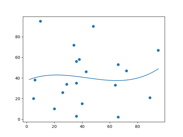
These values for the x- and y-axis should result in a very bad fit for polynomial regression:
import numpy
import matplotlib.pyplot as plt
x = [89,43,36,36,95,10,66,34,38,20,26,29,48,64,6,5,36,66,72,40]
y = [21,46,3,35,67,95,53,72,58,10,26,34,90,33,38,20,56,2,47,15]
mymodel = numpy.poly1d(numpy.polyfit(x, y, 3))
myline = numpy.linspace(2, 95, 100)
plt.scatter(x, y)
plt.plot(myline, mymodel(myline))
plt.show()
Result:

And the r-squared value?
Example
You should get a very low r-squared value.
import numpy
from sklearn.metrics import r2_score
x = [89,43,36,36,95,10,66,34,38,20,26,29,48,64,6,5,36,66,72,40]
y = [21,46,3,35,67,95,53,72,58,10,26,34,90,33,38,20,56,2,47,15]
mymodel = numpy.poly1d(numpy.polyfit(x, y, 3))
print(r2_score(y, mymodel(x)))
Try if Yourself »
The result: 0.00995 indicates a very bad relationship, and tells us that this data set is not suitable for polynomial regression.
截取页面反馈部分,让我们更快修复内容!也可以直接跳过填写反馈内容!