-
CSS Tutorial
- CSS HOME
- CSS Introduction
- CSS Syntax
- CSS Selectors
- CSS How To
- CSS Comments
- CSS Colors
- CSS Backgrounds
- CSS Borders
- CSS Margins
- CSS Padding
- CSS Height/Width
- CSS Box Model
- CSS Outline
- CSS Text
- CSS Fonts
- CSS Icons
- CSS Links
- CSS Lists
- CSS Tables
- CSS Display
- CSS Max-width
- CSS Position
- CSS Z-index
- CSS Overflow
- CSS Float
- CSS Inline-block
- CSS Align
- CSS Combinators
- CSS Pseudo-class
- CSS Pseudo-element
- CSS Opacity
- CSS Navigation Bar
- CSS Dropdowns
- CSS Image Gallery
- CSS Image Sprites
- CSS Attr Selectors
- CSS Forms
- CSS Counters
- CSS Website Layout
- CSS Units
- CSS Specificity
- CSS !important
- CSS Math Functions
-
CSS Advanced
- CSS Rounded Corners
- CSS Border Images
- CSS Backgrounds
- CSS Colors
- CSS Color Keywords
- CSS Gradients
- CSS Shadows
- CSS Text Effects
- CSS Web Fonts
- CSS 2D Transforms
- CSS 3D Transforms
- CSS Transitions
- CSS Animations
- CSS Tooltips
- CSS Style Images
- CSS Image Reflection
- CSS object-fit
- CSS object-position
- CSS Masking
- CSS Buttons
- CSS Pagination
- CSS Multiple Columns
- CSS User Interface
- CSS Variables
- CSS Box Sizing
- CSS Media Queries
- CSS MQ Examples
- CSS Flexbox
- CSS Responsive
- CSS Grid
- CSS SASS
- CSS Examples
- CSS References
CSS Horizontal Navigation Bar
Horizontal Navigation Bar
There are two ways to create a horizontal navigation bar. Using inline or floating list items.
Inline List Items
One way to build a horizontal navigation bar is to specify the <li> elements as inline, in addition to the "standard" code from the previous page:
Example explained:
display: inline;- By default, <li> elements are block elements. Here, we remove the line breaks before and after each list item, to display them on one line
Floating List Items
Another way of creating a horizontal navigation bar is to float the <li> elements, and specify a layout for the navigation links:
Example
li {
float: left;
}
a {
display: block;
padding: 8px;
background-color: #dddddd;
}
Try it Yourself »
Example explained:
float: left;- Use float to get block elements to float next to each otherdisplay: block;- Allows us to specify padding (and height, width, margins, etc. if you want)padding: 8px;- Specify some padding between each <a> element, to make them look goodbackground-color: #dddddd;- Add a gray background-color to each <a> element
Tip: Add the background-color to <ul> instead of each <a> element if you want a full-width background color:
Horizontal Navigation Bar Examples
Create a basic horizontal navigation bar with a dark background color and change the background color of the links when the user moves the mouse over them:
Example
ul {
list-style-type: none;
margin: 0;
padding: 0;
overflow: hidden;
background-color: #333;
}
li {
float: left;
}
li a {
display: block;
color: white;
text-align: center;
padding: 14px 16px;
text-decoration: none;
}
/* Change the link color to #111 (black) on hover */
li a:hover {
background-color: #111;
}
Try it Yourself »
Active/Current Navigation Link
Add an "active" class to the current link to let the user know which page he/she is on:
Right-Align Links
Right-align links by floating the list items to the right (float:right;):
Example
<ul>
<li><a href="#home">Home</a></li>
<li><a href="#news">News</a></li>
<li><a href="#contact">Contact</a></li>
<li style="float:right"><a class="active" href="#about">About</a></li>
</ul>
Try it Yourself »
Border Dividers
Add the border-right property to <li> to create link dividers:
Example
/* Add a gray right border to all list items, except the last item (last-child) */
li {
border-right: 1px solid #bbb;
}
li:last-child {
border-right: none;
}
Try it Yourself »
Fixed Navigation Bar
Make the navigation bar stay at the top or the bottom of the page, even when the user scrolls the page:
Note: Fixed position might not work properly on mobile devices.
Gray Horizontal Navbar
An example of a gray horizontal navigation bar with a thin gray border:
Example
ul {
border: 1px solid #e7e7e7;
background-color: #f3f3f3;
}
li a {
color: #666;
}
Try it Yourself »
Sticky Navbar
Add position: sticky; to <ul> to create a sticky navbar.
A sticky element toggles between relative and fixed, depending on the scroll position. It is positioned relative until a given offset position is met in the viewport - then it "sticks" in place (like position:fixed).
Note: Internet Explorer do not support sticky positioning. Safari requires a -webkit- prefix (see example above). You must also specify at least one of top, right, bottom or left for sticky positioning to work.
More Examples
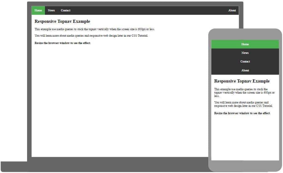
Responsive Topnav
How to use CSS media queries to create a responsive top navigation.
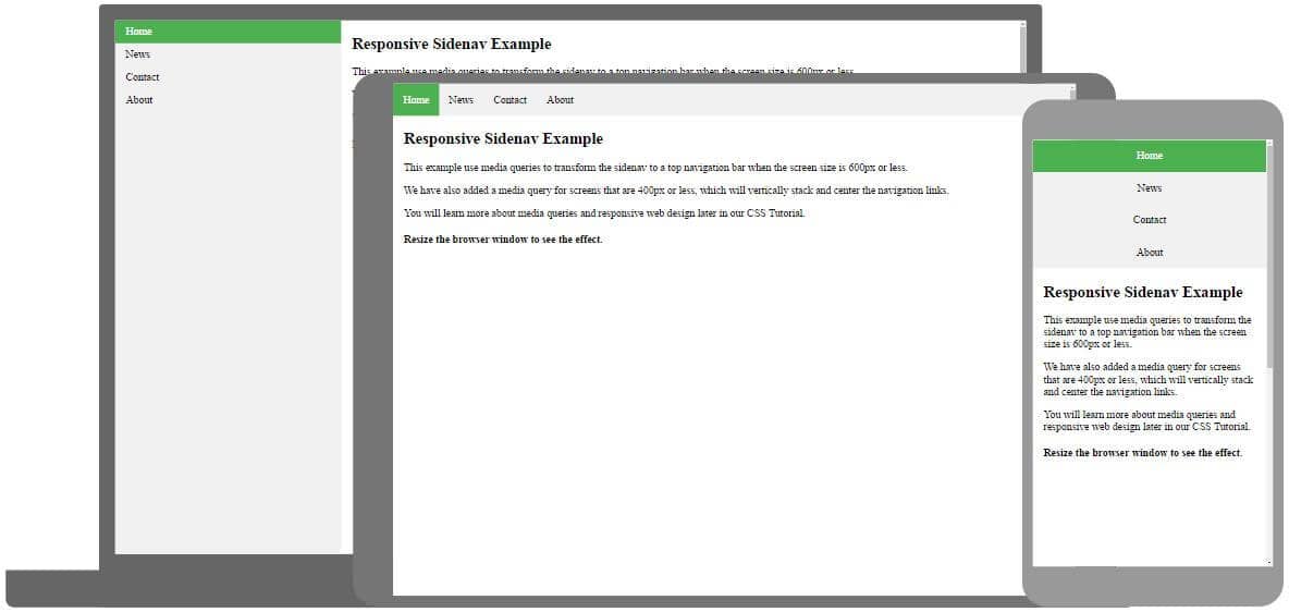
Responsive Sidenav
How to use CSS media queries to create a responsive side navigation.
Ever heard about 91xjr Spaces? Here you can create your website from scratch or use a template, and host it for free.
Get started for free ❯* no credit card required
截取页面反馈部分,让我们更快修复内容!也可以直接跳过填写反馈内容!