-
CSS Tutorial
- CSS HOME
- CSS Introduction
- CSS Syntax
- CSS Selectors
- CSS How To
- CSS Comments
- CSS Colors
- CSS Backgrounds
- CSS Borders
- CSS Margins
- CSS Padding
- CSS Height/Width
- CSS Box Model
- CSS Outline
- CSS Text
- CSS Fonts
- CSS Icons
- CSS Links
- CSS Lists
- CSS Tables
- CSS Display
- CSS Max-width
- CSS Position
- CSS Z-index
- CSS Overflow
- CSS Float
- CSS Inline-block
- CSS Align
- CSS Combinators
- CSS Pseudo-class
- CSS Pseudo-element
- CSS Opacity
- CSS Navigation Bar
- CSS Dropdowns
- CSS Image Gallery
- CSS Image Sprites
- CSS Attr Selectors
- CSS Forms
- CSS Counters
- CSS Website Layout
- CSS Units
- CSS Specificity
- CSS !important
- CSS Math Functions
-
CSS Advanced
- CSS Rounded Corners
- CSS Border Images
- CSS Backgrounds
- CSS Colors
- CSS Color Keywords
- CSS Gradients
- CSS Shadows
- CSS Text Effects
- CSS Web Fonts
- CSS 2D Transforms
- CSS 3D Transforms
- CSS Transitions
- CSS Animations
- CSS Tooltips
- CSS Style Images
- CSS Image Reflection
- CSS object-fit
- CSS object-position
- CSS Masking
- CSS Buttons
- CSS Pagination
- CSS Multiple Columns
- CSS User Interface
- CSS Variables
- CSS Box Sizing
- CSS Media Queries
- CSS MQ Examples
- CSS Flexbox
- CSS Responsive
- CSS Grid
- CSS SASS
- CSS Examples
- CSS References
CSS Styling Images
Learn how to style images using CSS.
Rounded Images
Use the border-radius property to create rounded images:
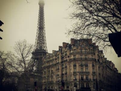
Thumbnail Images
Use the border property to create thumbnail images.
Thumbnail Image:
Example
img {
border: 1px solid #ddd;
border-radius: 4px;
padding: 5px;
width: 150px;
}
<img src="paris.jpg" alt="Paris">
Try it Yourself »
Thumbnail Image as Link:
Example
img {
border: 1px solid #ddd;
border-radius: 4px;
padding: 5px;
width: 150px;
}
img:hover {
box-shadow: 0 0 2px 1px rgba(0, 140, 186, 0.5);
}
<a href="paris.jpg">
<img src="paris.jpg" alt="Paris">
</a>
Try it Yourself »
Responsive Images
Responsive images will automatically adjust to fit the size of the screen.
Resize the browser window to see the effect:
If you want an image to scale down if it has to, but never scale up to be larger than its original size, add the following:
Tip: Read more about Responsive Web Design in our CSS RWD Tutorial.
Center an Image
To center an image, set left and right margin to auto and make it into a block element:
Example
img {
display: block;
margin-left: auto;
margin-right: auto;
width: 50%;
}
Try it Yourself »
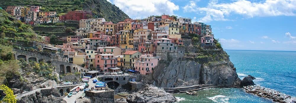
Polaroid Images / Cards
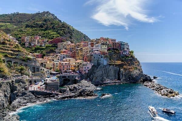
Cinque Terre

Northern Lights
Example
div.polaroid {
width: 80%;
background-color: white;
box-shadow: 0 4px 8px 0 rgba(0, 0, 0, 0.2), 0 6px 20px 0 rgba(0, 0, 0, 0.19);
}
img {width: 100%}
div.container {
text-align: center;
padding: 10px 20px;
}
Try it Yourself »
Transparent Image
The opacity property can take a value from 0.0 - 1.0. The lower value, the more transparent:
opacity 0.2
opacity 0.5
opacity 1
(default)
Image Text
How to position text in an image:
Example
Try it Yourself:
Top Left » Top Right » Bottom Left » Bottom Right » Centered »Image Filters
The CSS filter property adds visual effects (like blur and saturation) to an element.
Note: The filter property is not supported in Internet Explorer or Edge 12.
Example
Change the color of all images to black and white (100% gray):
img {
filter: grayscale(100%);
}
Tip: Go to our CSS filter Reference to learn more about CSS filters.
Image Hover Overlay
Create an overlay effect on hover:
Flip an Image
Move your mouse over the image:
Responsive Image Gallery
CSS can be used to create image galleries. This example use media queries to re-arrange the images on different screen sizes. Resize the browser window to see the effect:


Example
.responsive {
padding: 0 6px;
float: left;
width: 24.99999%;
}
@media only screen and (max-width: 700px){
.responsive {
width: 49.99999%;
margin: 6px 0;
}
}
@media only screen and (max-width: 500px){
.responsive {
width: 100%;
}
}
Try it Yourself »
Tip: Read more about Responsive Web Design in our CSS RWD Tutorial.
Image Modal (Advanced)
This is an example to demonstrate how CSS and JavaScript can work together.
First, use CSS to create a modal window (dialog box), and hide it by default.
Then, use a JavaScript to show the modal window and to display the image inside the modal, when a user clicks on the image:
Example
// Get the modal
var modal = document.getElementById('myModal');
// Get the image and insert it inside the modal - use its "alt" text as a caption
var img = document.getElementById('myImg');
var modalImg = document.getElementById("img01");
var captionText = document.getElementById("caption");
img.onclick = function(){
modal.style.display = "block";
modalImg.src = this.src;
captionText.innerHTML = this.alt;
}
// Get the <span> element that closes the modal
var span = document.getElementsByClassName("close")[0];
// When the user clicks on <span> (x), close the modal
span.onclick = function() {
modal.style.display = "none";
}
Try it Yourself »
截取页面反馈部分,让我们更快修复内容!也可以直接跳过填写反馈内容!