W3.CSS Containers
This is my Header
This is my Article
This article is light grey and the text is brown. This article is light grey and the text is brown. This article is light grey and the text is brown. This article is light grey and the text is brown. This article is light grey and the text is brown.
This is my Footer
The Container Class
The w3-container class adds a 16px left and right padding to any HTML element.
The w3-container class is the perfect class to use for all HTML container elements like:
<div>, <article>, <section>, <header>, <footer>, <form>, and more.
Containers Provides Equality
The w3-container provides equality for all HTML container elements:
- Common margins
- Common paddings
- Common alignments
- Common fonts
- Common colors
To use a container, just add a w3-container class to any element:
Example
<div class="w3-container">
<p>The w3-container class is an important w3.CSS class.</p>
</div>
Try It Yourself »
To add a color, just add a w3-color class:
Example
<div class="w3-container w3-red">
<p>London is the capital city of England.</p>
</div>
Try It Yourself »
Headers and Footers
The w3-container class can be used to style headers:
Header
There is no difference in the way W3.CSS treats <div> and <header> elements.
The w3-container class can be used to style footers:
Example
<div class="w3-container w3-teal">
<h5>Footer</h5>
<p>Footer information goes here</p>
</div>
Try It Yourself »
Example
<footer class="w3-container w3-teal">
<h5>Footer</h5>
<p>Footer information goes here</p>
</footer>
Try It Yourself »
Many web pages use <div> elements instead of <header> and <footer> elements.
Articles and Sections
The w3-container class can be used to style <article> and <section> elements:
Example
<div class="w3-container">
<h2>London</h2>
<p>London is the most populous city in the United Kingdom,
with a metropolitan area of over 9 million inhabitants.</p>
</div>
<article class="w3-container">
<h2>Paris</h2>
<p>The Paris area is one of the largest population centers in Europe,
with more than 2 million inhabitants.</p>
</article>
<section class="w3-container">
<h2>Tokyo</h2>
<p>Tokyo is the center of the Greater Tokyo Area,
and the most populous metropolitan area in the world.</p>
</section>
Try It Yourself »
Many web pages uses <div> elements instead of <article> and <section> elements.
Web Page Example
Header

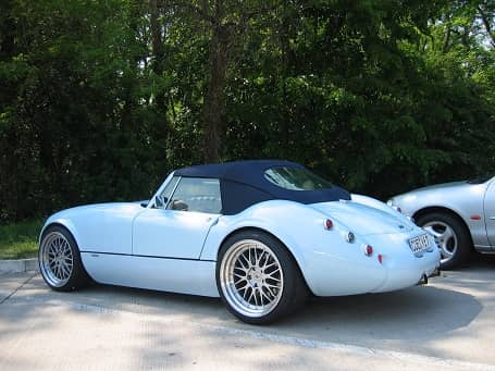
A car is a wheeled, self-powered motor vehicle used for transportation. Most definitions of the term specify that cars are designed to run primarily on roads. (Wikipedia)
Example using HTML <div> elements
<div class="w3-container w3-red">
<h1>Header</h1>
</div>
<img src="img_car.jpg" alt="Car" style="width:100%">
<div class="w3-container">
<p>A car is a wheeled, self-powered motor vehicle used for transportation. Most definitions of the term specify that cars are designed to run primarily on roads. (Wikipedia)</p>
</div>
<div class="w3-container w3-red">
<h5>Footer</h5>
</div>
Try It Yourself »
Example using HTML semantic elements
<header class="w3-container w3-teal">
<h1>Header</h1>
</header>
<img src="img_car.jpg" alt="Car" style="width:100%">
<article class="w3-container">
<p>A car is a wheeled, self-powered motor vehicle used for transportation. Most definitions of the term specify that cars are designed to run primarily on roads. (Wikipedia)</p>
</article>
<footer class="w3-container w3-teal">
<h5>Footer</h5>
</footer>
Try It Yourself »
Container Padding
The w3-container class has a default 16px left and right padding, and no top or bottom padding:
Example
<div class="w3-container w3-blue">
I have no top or bottom padding.
</div>
Try It Yourself »
Normally you will not have to change the default padding of a container, because paragraphs and heading provide margins that will simulate padding.
I am a Heading
I am a paragraph.
Example
<div class="w3-container w3-blue">
<h1>I am a Heading</h1>
<p>I am a paragraph.</p>
</div>
Try It Yourself »